Drop down menu is a part of almost every web page today. These menus give a nice solution of choosing from the list of items to website visitors as well to Web Developers, so that they don’t have to worry about the presentation, as it can be now combined with appealing effects through CSS styling.
In this tutorial we will learn to create CSS horizontal drop down menu.
Step 1-Main Div of the Menu
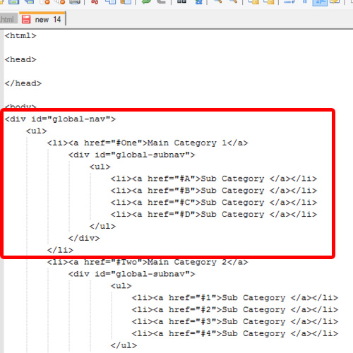
First of all, open up the div tag , just after the body tag, and give it an id. This is our main div which will contain all the elements.
After that, open up an unordered list tag and then open up the list tag to define its members. We will insert the hyperlink tag which is called an anchor tag.
Then after this, we will write the heading for the first list. As this would act as the parent category, define it as “Main Category One”.
After that, open up an unordered list tag again and then define the child members for the Main category, in the same manner as we did earlier. This list will be considered as the sub categories of our main menu.
<body>
<div id=”global-nav”>
<ul>
<li><a href=”#One”>Main Category 1</a>
<div id=”global-subnav”>
<ul>
<li><a href=”#A”>Sub Category </a></li>
<li><a href=”#B”>Sub Category </a></li>
<li><a href=”#C”>Sub Category </a></li>
<li><a href=”#D”>Sub Category </a></li>
</ul>
</div>
</li>
Step 2- Second Main Category
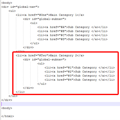
With that done, we will follow the same pattern to make another category in our drop down menu.
We will start with the <li> tag and follow exactly the same pattern as before.
The Code for that would be:
<li><a href=”#Two”>Main Category 2</a>
<div id=”global-subnav”>
<ul>
<li><a href=”#1″>Sub Category </a></li>
<li><a href=”#2″>Sub Category </a></li>
<li><a href=”#3″>Sub Category </a></li>
<li><a href=”#4″>Sub Category </a></li>
</ul>
</div>
</li>
Step 3- Global- Navigation Class Explained
Now add the CSS Styling on the drop down menu.
For that, open up the style tag beneath the HTML header and assign “text/ css” in style type.
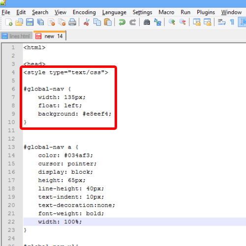
Then describe the working of the classes, starting with the very first class we used, the global- nav class. This class is responsible for the Main look of the Menu. We have set its width to 135 pixels with left as its default position along with a background color.
Code for that would be:
#global-nav {
width: 135px;
float: left;
background: #e8eef4;
}
Step 4- Anchor Class
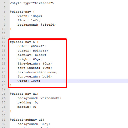
After that, define the effects of the anchor tag. In this class, we are actually describing the effect of all the anchor tags inside the “global-nav “ class and specifying it a particular color, with a cursor type as pointer and setting its alignment as well.
The Code is:
#global-nav a {
color: #034af3;
cursor: pointer;
display: block;
height: 65px;
line-height: 40px;
text-indent: 10px;
text-decoration:none;
font-weight: bold;
width: 100%;
}
Step 5- Contents of Main Menu
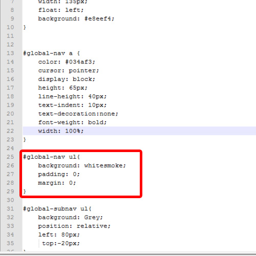
With that done, the effect of the Main Menu’s contents is described in the global-nav ul class. The background color is specified as white smoke along with zero in padding and margins.
The code for this class would be:
#global-nav ul{
background: whitesmoke;
padding: 0;
margin: 0;
}
Step 6-Sub Navigation Class
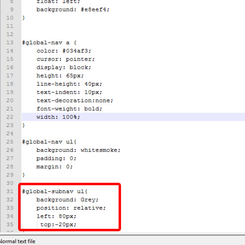
Next, we have defined the sub navigation menu class. This class will be responsible for the effect of the sub menu. We are using Grey as a background color and aligning it, with 80 pixels for the left side and minus 20 pixels for the top.
Code would be:
#global-subnav ul{
background: Grey;
position: relative;
left: 80px;
top:-20px;
}
Step 7- Global –Nav Li class
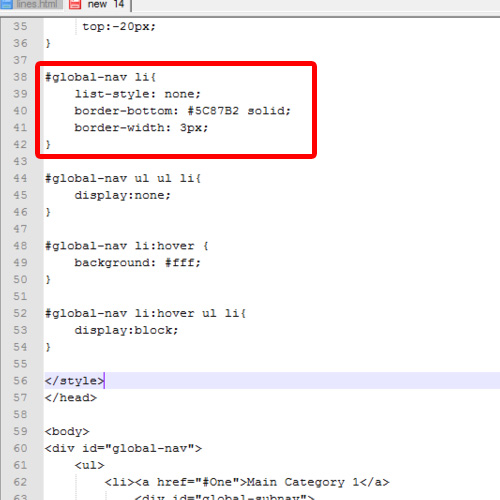
After that, the borders of the list elements are defined in the global –nav li class.
We are setting a solid color effect of border at bottom having a width of 3 pixels.
Its code would be:
#global-nav li{
list-style: none;
border-bottom: #5C87B2 solid;
border-width: 3px;
}
Step 8- Display Style and Hover Effects
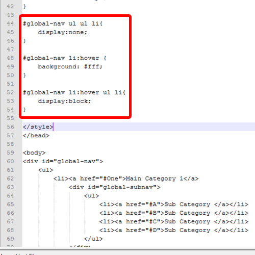
Next, we are defining the “li” class which refers to the inner elements of the main menu.
There we are setting its display as none by default. This means that the effect will be applied on the “li” which is inside an unordered list, which is nested inside another unordered list that can be found in global-nav class
Next, we will work on the hover effect, which will be defined here in which we have specified the color which would be changed once the mouse hovers over the option.
Lastly, the display of list elements is defined as Blocks, so that they will be displayed in separate segments.
Step 9- View in Browser
Save the file as html extension and then open it up in the browser to see the result. It would be observed that the menu will appear as the way we have coded it, having all the styles, colors, effects and hovers.
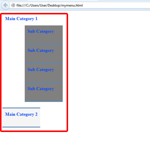
And that is how we can create CSS horizontal drop down menu.
 Home
Home