In this tutorial, you will learn how to use Bitcoin exchange rate charts.
Step 1.
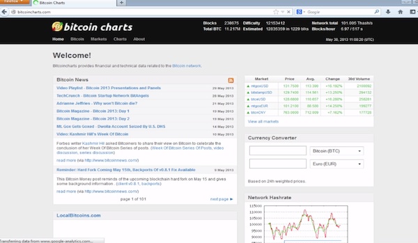
Open up the website: bitcoincharts.com. A standard stock chart is displayed. As you can see, bitcoin is currently doing quite well.
Step 2.
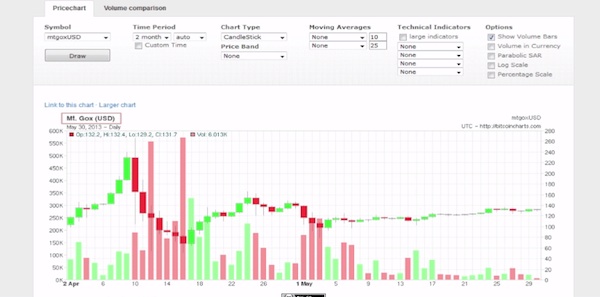
Make sure the currency is mtgoxUSD.
Step 3.
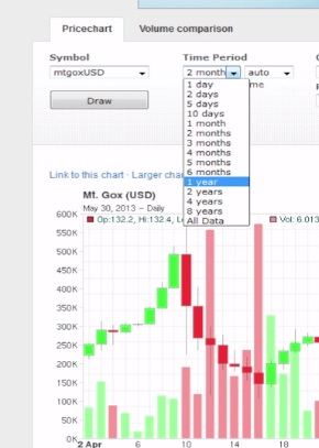
On the Time Period, you can choose a larger time span to evaluate the graphic. We’ll choose one year. Clearly, there is an evolution. Now let’s see what parameters influenced that evolution.
Step 4.
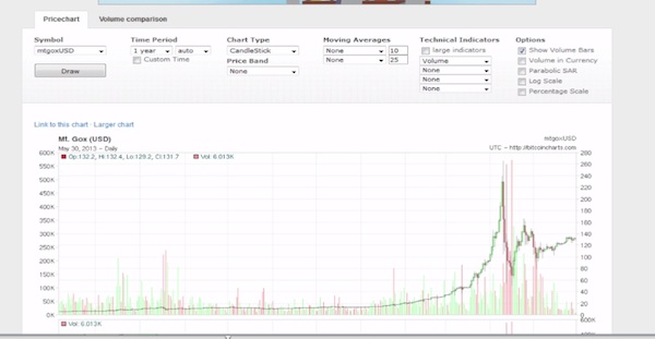
On the Technical Indicators section, choose “Volume”. It will display an additional graph tracking only the registered volume of the currency. You can obtain about the same thing by clicking on the “Show Volume Bars” in the Options section.
Step 5.
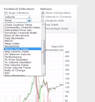
Raising volume in the Bitcoin is good, but how fluid is it all? From the Technical Indicators section, choose Money Flow index. A second graph appears. It looks like this currency doesn’t have yet a major oversupply.
Step 6.
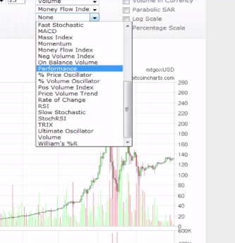
That’s good. Now, how about price? From the Technical Indicators section, choose “Performance”. Interesting: this currency only evolved, with a harsh peak of up and down around the Japan cyber-attack events. For every Bitcoin that you would have bought one year ago, you would receive 7 times its value right now.
Step 7.
That sounds like a good investment. Let’s check one more parameter.
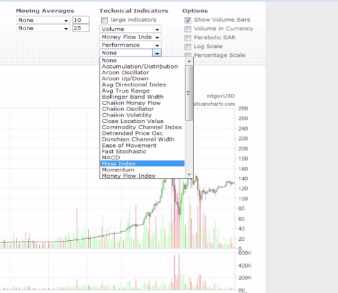
From the Technical Indicators, choose “Mass Index”. If you don’t know what it is, think of Mass Index as an the gravity of your car when you accelerate or decelerate it. This index was developed by Donald Dorsey specifically to seize trend reversal points – the ones everybody is after.
As we see according to the Mass Index, this currency is going to lose in the near future, so it’s wiser not to invest.
We saved you a dime!
Result: Congratulations, you have learned the basics of interpretation for Bitcoin exchange charts.
 Home
Home