In this tutorial, we will teach you how to design a typographic invitation card using Adobe Illustrator.
Step 1 – Setting up the document
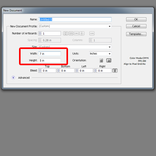
Let’s start by opening up a new document of 7 by 5 inches. You can keep any size for your invitation card, but for this tutorial we will be making a standard size print ready card.
Step 2 – Working with the text
Since we are designing an invitation for a tea party, we will use a basic illustration of a tea cup (see image below). This is so that we can get an idea of the outlines we would be working in for the typographic poster.
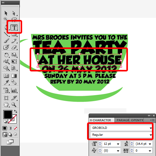
Now let’s create a new layer and use the type tool to insert the text. In an invitation card, you should start with including the host name, followed by the place where the event is going to take place. The exact date and time should also be included here. For this tutorial, we will choose “Grobold” for the font style.
Once done, let’s copy small portions of the text and roughly align them over the tea cup. Complete the rest of the text and we would have something like this at the end. This is just a rough alignment. We will use the pen tool to edit each line out according to the shape behind later.
Step 3 – Adding text over the cup handle
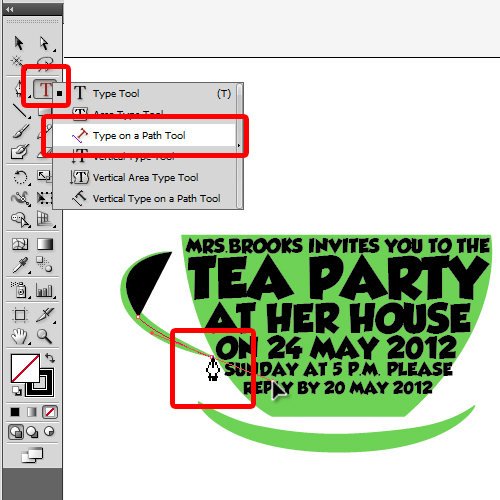
For adding text on the cup handle, we will pick up the pen tool and draw over it, like so. With that done, let’s remove the color fill, pick up the Smooth Tool and click on the newly created shape. This will smooth out the edges. With that done, let’s pick up the Type to path tool and write over the handle.
Step 4 – Drawing over the base of the cup
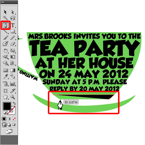
With that done, let’s use the pen tool to draw a base of the cup. We will simply draw over the background shape and the basic structure is now ready.
Step 5 – Creating Outlines
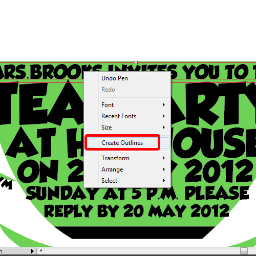
Now select the text and right click on it. From the menu, choose the create outline option. Now we can treat each and every letter in the text individually.
Step 6 – Editing each letter
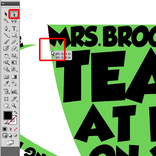
Let’s pick up the direct selection tool to alter the shape of the text according to the shape of the cup. The idea is to follow the boundaries of the shape. For example, for the letter M over here, we will make sure that the anchor points fill the background shape from the left side. All you have to do is drag the anchor points to the edges of the shape. That means the text should cover all the edges of the shape.
Step 7 – Continuing on with the typography
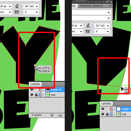
The same has to be done for all sides. For example in the next line, lets drag the anchor points in the letter Y towards the right edge, following the circular shape of the tea cup.
We will do the same for each and every line and each and every letter in the text. At the end, we have something like this on the canvas.
Step 8 – Adding the saucer
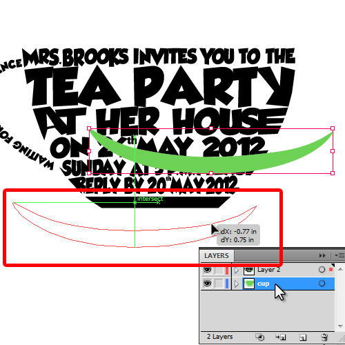
Once the type is set inside the cup shape, copy the saucer image from the “cup” layer and paste it on “layer 2”.
Now we can delete the “cup” layer and change the color of the saucer to black.
Step 9 – Adding the rest of the text
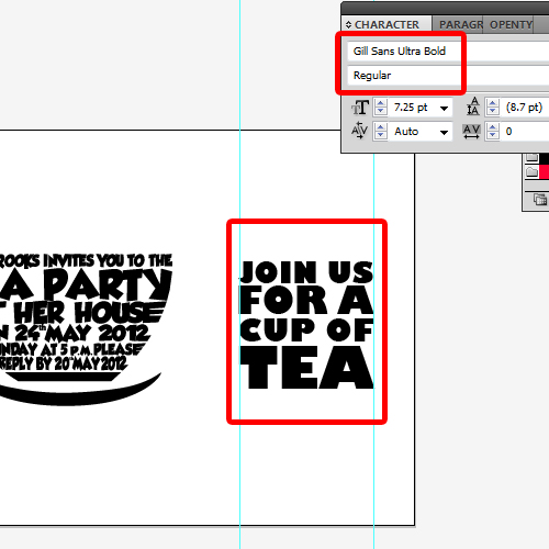
Invitation cards should also include a quote of some sort. For now, we’ll simply write Join us for a cup of tea. The alignment is done the same way as we did for the tea cup. Different textboxes have been used for each line. This just makes it easy to align the text according to your requirements. For the font style, we have used “Gill Sans Ultra Bold” and placed it parallel to the cup.
Step 10 – Adding the background
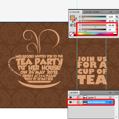
Now let’s create a new layer and name it Background. With that done, let’s drag this layer below the “layer 2”. You can get your hands on such backgrounds by going to the many free vector stock graphic websites.
You can test with different backgrounds to see which fit with the artwork. With that done, we will select the whole artwork and change the color to “F2B981”. With that done, let’s change the percentage of black to 14% and our invitation card is now ready.
 Home
Home