In this tutorial we will show you an overview and give a general idea as to how to design and set up a blog layout for the web. For your convenience, we have divided this tutorial into three parts covering, the basic structure, inserting text and images and adding effects. This first part will give an idea to design menu, choose their place, and insert buttons and option panels in a blog.
Follow this step by step guide to learn how to create a basic structure of a blog layout in Photoshop.
Step # 1 – Fill up the Background
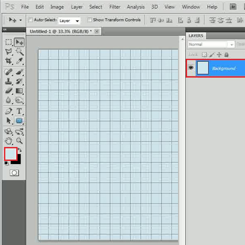
First of all, launch Adobe Photoshop and open up a blank document of “1200×1400” pixels in size. Now click on the “Foreground” color, set it to “d2e9f2” and press the “Alt+Backspace” key on the keyboard to fill the page.
Step # 2 – Create a Main Menu
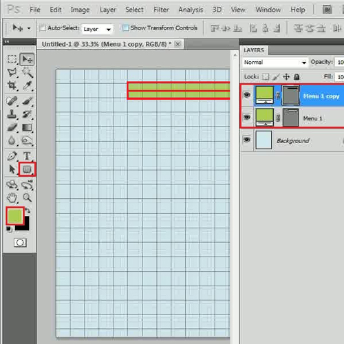
Once done, select the “Rounded Rectangular” tool from the menu and set its “Radius” to “10 px”. Now choose its “Color” as “adcf4f” and draw a rectangular shape on the top right corner of the page. Rename this layer as “Menu 1”and create a duplicate layer. Select the “Show Transform Controls” option and reduce its height to half of the original. Now combine these layers into a group and rename it to “Menu Green”.
Step # 3 – Create a Sub Menu
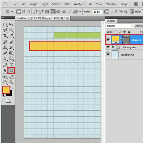
Once done, select the same “Rounded Rectangular” tool with the “Radius” of “10 px”, choose its “Color” as “fecf2e” and draw a rectangular shape below the previous one.
Step # 4 – Create a Search Box
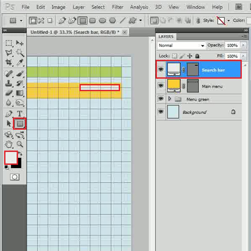
Now select the “Rectangular” tool, choose its color as “ececec” and draw a small rectangular shape over the right corner of the yellow shape. Rename the “Shape 1” layer as “Main menu”, “Shape 2” as “Search box”, combine them into a group and rename it to “Menu Yellow”.
Step # 5 – Create a Main Background
Select the “Rectangular” tool, choose its color as “ffffff”, draw a main body of the blog and change the layer name to “Background”.
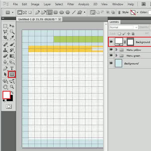
Step # 6 – Create a Main Image Holder
Now draw another small rectangular shape by choosing its color as “ececec” at the top left corner of the main page and change the layer name to “Main img”.
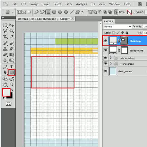
Step # 7 – Create an Image Detail Pane
In this step, draw a small rectangular shape by choosing its color as “dae7ec” at the right side of the “Main img” and change the layer name to “Right column”. Draw one more rectangular shape by choosing its color as “abcdda” below previous shapes and change the layer name to “Bottom part”. Now move this layer below other layers and adjust their size accordingly. Once done, combine these layers into a group and rename it to “Main img”.
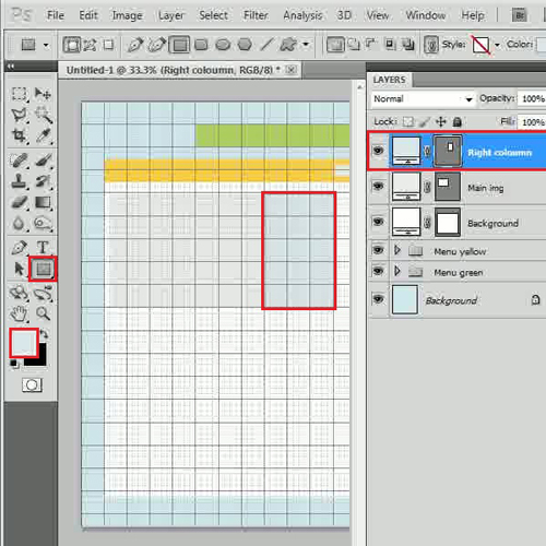
Step # 8 – Create Featured Image Holders
Now once again select the “Rectangular” tool, choose its color as “ececec”, draw a square shape and change the layer name to “Img1”. Once drawn, copy this layer and paste it twice below the original one.
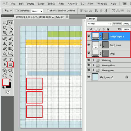
Step # 9 – Create Buttons
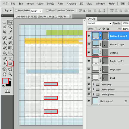
Once completed, select the “Rounded Rectangular” tool, choose its color as “abcdda” and draw a shape of a button. Change its layer name to “Button 1” and copy it the same way like we did in the previous step. Insert these buttons, once done combine these layers into a group and rename it to “Main blog”.
Step # 10 – Create a Side Pane
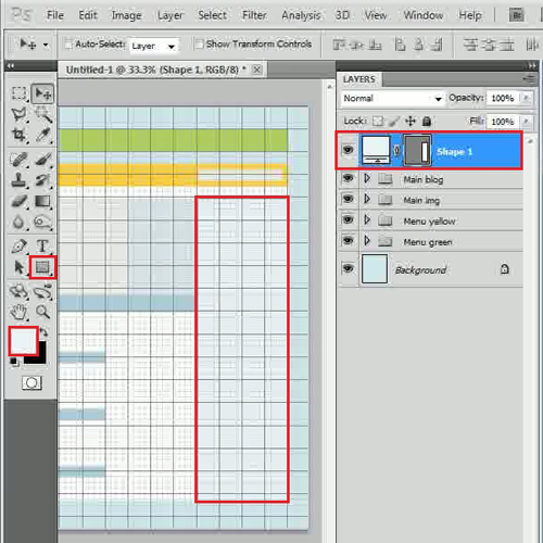
Now select the “Rectangular” tool from the menu and choose its color as “ebf4f7”. After selecting the color, draw a rectangular shape panel at the right corner of the page.
Step # 11 – Create Add Spaces
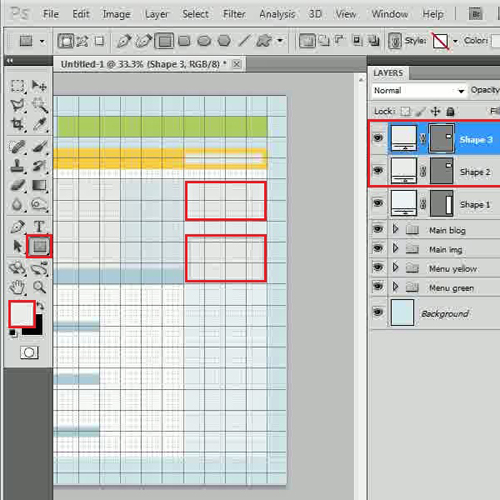
In this step, select the “Rectangular” tool again and change its color to “ececec”. Once done, draw two small rectangular shapes at the top of the side panel. These boxes work as Add Spaces on the web page.
Step # 12 – Create Thumbnail Holders
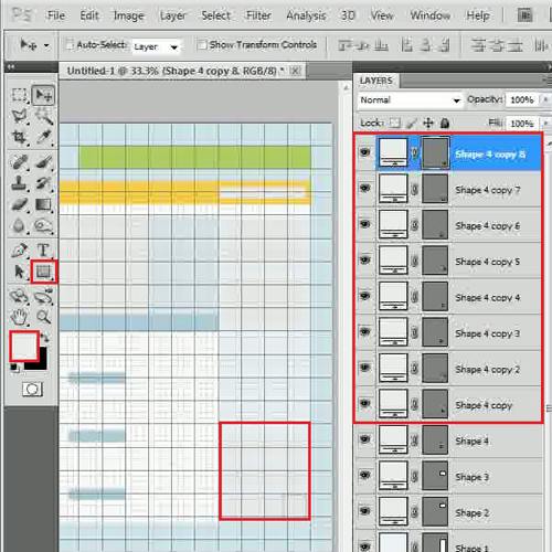
Now draw a small square shape by using the same color at the bottom of the panel, create eight more duplicate layers and arrange them accordingly. Combine these layers into a group, rename it to “Side bar” and your blog consisting of the design menu is complete.
 Home
Home