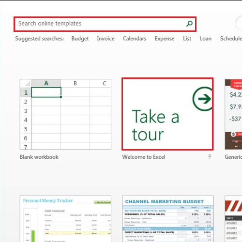
The new Excel 2013 comes with new features and a fresh design which includes splash screen with faster loading speed. When opened, the new version takes you directly to the landing page which has lots of built in templates. There is a search bar through which you can search for different online office templates. In this guide, we will give you Excel 2013 overview.
Step # 1-Select images
Once you open Excel, a number of templates are shown to you and you can scroll down to see more or even search online by typing in the search bar which is on the top left side of the page.
Excel 2013 new features include a built in tour guide which tells about the new features.
Click on the “welcome to excel” thumbnail and an excel sheet will open.
Step # 2 – Adjustment
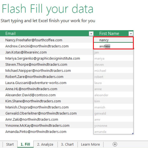
A handy feature added to excel is the “flash fill” option. This feature recognizes your data patterns to a point where it will be able to predict and enter the data in the blank cells.
Over here, we have a list of email addresses which include first names followed by their last names. As soon as you are done filling in the first two cells with first names, excel predicts the rest and shows you how the rest of the blanks will be filled by the “flash fill” feature. To fill the rest of the blank cells, press the “enter” button.
Step # 3 – View quick analysis feature
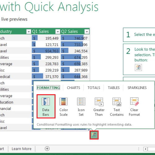
In order to save time, Excel came up with a feature called “quick analysis”. In the next sheet, we’d have a table. Select the table and the “quick analysis” button will appear on the bottom right hand side of the table. Click on it and a box will appear which will show you some options which can be applied to the chart. These options include “formatting, charts, totals, tables and sparklines”. When you hover over them, you will be able to see their preview.
Step # 4 – Select Recommended Charts button
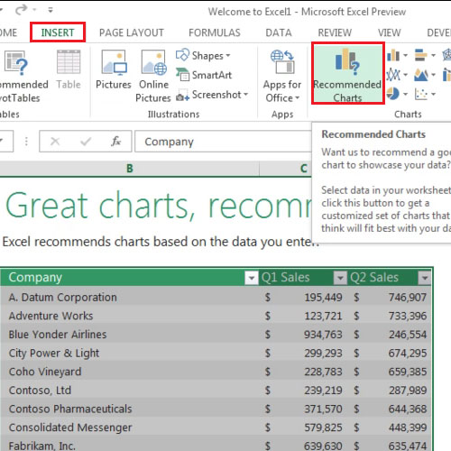
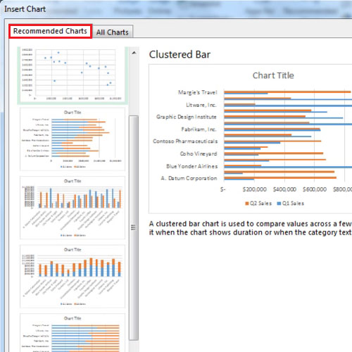
Excel 2013 new features also include “recommended charts” feature. Through this feature, Excel shows you the logical options which describe your data in the best way possible in the form of graphical representation. In order to use the new feature, select the table and then click on the “recommended charts” button by going to the “insert” tab.
Step # 5: Add a chart
Once you have clicked on the “Recommended charts” button, the “insert chart” box appears with a list of recommended charts. You can also view the rest of the options by going to the “all charts” tab.
Step # 6 – Edit the Chart
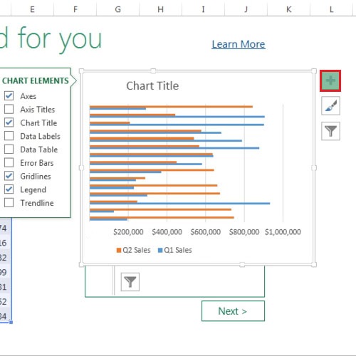
Once the chart has been added, three buttons will appear on the top right corner of the chart. The top button will allow you to add or remove chart elements.
Step # 7: Edit the chart
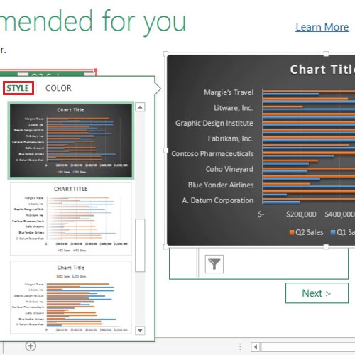
Through the middle button, you will be able to change the graph’s style and color.
The bottom button deals with the filters added to the chart. You can add or remove categories and series from this option. Hopefully, with the Excel 2013 overview, you won’t have difficulty finding your way around.
 Home
Home