Microsoft Excel is a detailed software that can be used as a multiple analysis tool. It gives simple options that can help you manage and manipulate data to derive desired or actual results. It is important to understand the workings of this software to be able to use it effectively. Column Charts in Excel can be altered and formatted as per your requirements and can give a very presentable look. To learn how to modify charts in Excel, follow this step by step tutorial.
Step # 1 – Select ‘Above Chart’
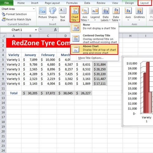
Click on the Column Chart in Excel and go to the “Layout” tab. Click on the “Chart Title” button in the Labels section. From the drop down menu that appears, select the “Above Chart” option.
Step # 2 – Choose ‘Work Art Styles’ for the title
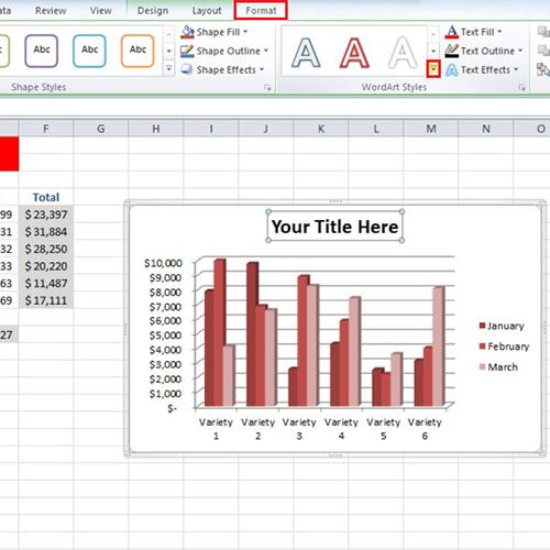
With that done, a title will be added to the chart. Now go to the “Format” tab and expand the “Work Art Styles” menu. Choose a style from the given options for your Title.
Step # 3 – Use ‘Shape Styles’
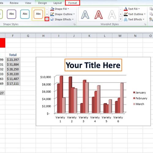
To further modify Charts in Excel, select a style for your ‘Chart Title’ and move over to the “Shape Styles” section. From here, you can add a shape to your title.
Step # 4 – Click on ‘Format Date Point’
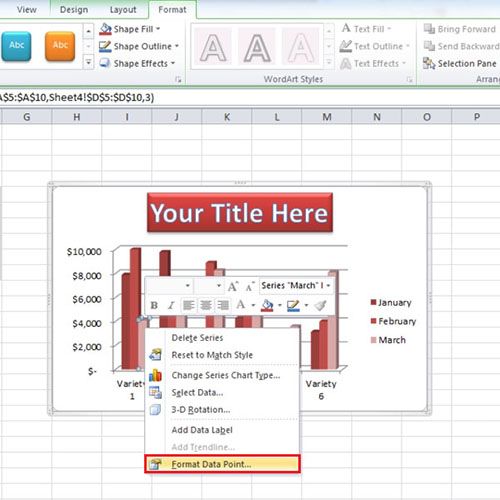
Now let’s look into how to highlight a single bar from the chart. As you can see that the third bar is showing a decline in sales. What if you want to highlight that particular bar? For that, select the bar, right-click and move over to the “Format Date Point” option.
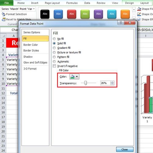
Step # 5 – Apply ‘Solid Fill’
Go to the “Fill” tab and select any of the options to color the selected bar. For this tutorial, we have selected the “Solid Fill” option. Once you make the changes, they will be applied to the bar. You can even change the transparency of the bar in the graph.
 Home
Home