A trendline can be a valuable indicator on a graph. This tutorial will show you how to easily add trendline excel chart.
Step # 1 – Opening the Data
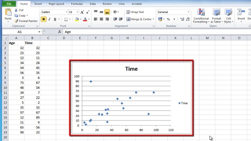
Open Excel and make sure that you have a graph with some data included. Trendlines are most often added to scatter graphs and they look most effective in this format. As you can see here we have some data in the graph that certainly does follow a trend.

Step # 2 – Accessing the Trendline Options
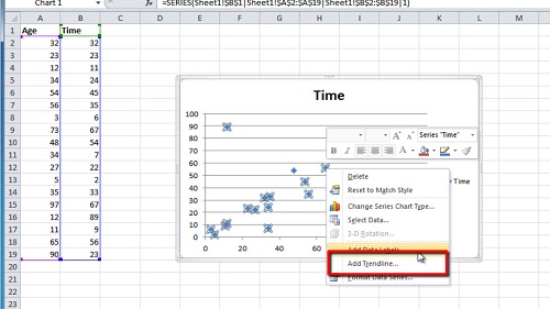
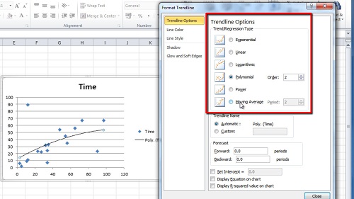
Right click on anyone of the points on the graph and in the menu that appears click “Add Trendline”. The “Format Trendline” window will appear and you will have several options. The most popular type of line to add is the “Linear” trendline and this is selected by default – you will also see that it has been added to your graph.

Step # 3 – Viewing Other Trendlines
Click on some of the other trendlines and the line on the graph will automatically be changed to reflect this option change. Here we are sticking with the linear line so select this and click “Close”. This is how to add trendline excel graph.

 Home
Home