Designing a magazine cover in Photoshop is not any different from creating any other type of design.Its design principles are same as for any other artwork piece. There are just few elements which need to be part of every magazine cover like the title name of the magazine which is known as “masthead”, price and its issue date. Remember that every magazine has a story to tell and that means, your magazine cover should feature the lead story with due prominence. You can add other captions to give a peep to the customer that what does this magazine contain. Mostly the major portion of the magazine cover is filled with artwork which can be a photograph or an illustration. In this Photoshop tutorial you will learn how to make your magazine cover an attention seeker and what will be the elements which are considered to be a standard part of the magazine cover.
Follow the steps by step guide to learn how to design a magazine cover.
Step # 1 – Create a new document
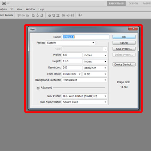
Starts by designing a magazine cover by opening a new document of size 8.5 inches by 11.5 inches. The standard size of a magazine cover is 8 inches by 11 inches but we also need to leave some bleed area. There are many different sizes which exist for the magazine. The type of magazine and the content helps to decide its size.
Step # 2 – Create a bleed area
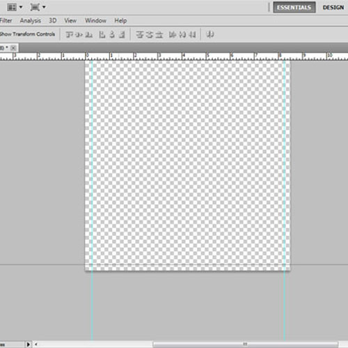
Now we will draw margin lines of 0.25 inches on all four sides of the canvas to create the bleed area. The bleed area is cropped out after the printing process but it is created so that there are no blank spaces visible at the edges after printing.
Step # 3 – Fill the background
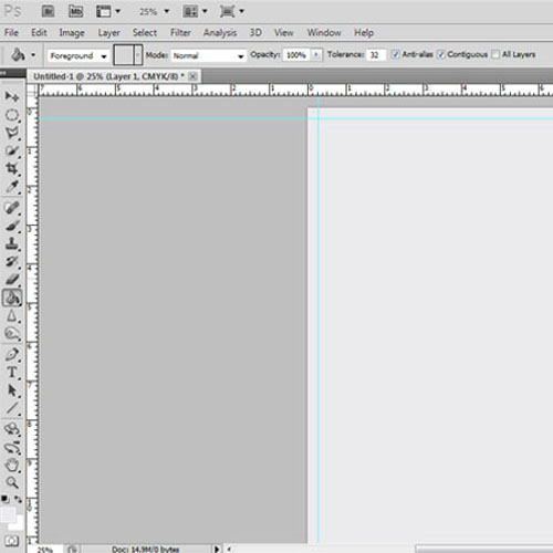
We will now fill the background with a grey color. The background color also depends on the theme of the magazine and the image you are going use for the cover.
Step # 4 – Open an image
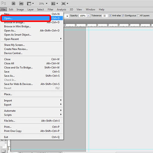
Now open the image which you want to use for the cover by going to the “File” menu, dropping down to “Open” and from the window that opens choosing the picture you need. Once you do, adjust its placement. You can also rotate, flip or crop the image to make it look attractive. The image should cover the bleed area.
Step # 5 – Change the blend mode
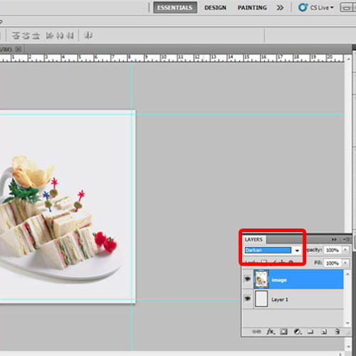
Rename the layer as “image “. Now change the image layer mood to “darken” to hide the white area or extra areas. Use the soft round eraser to remove the edges of the image. These settings are for the specific image. When using a different image, the settings will change.
Step # 6 – Create margin lines
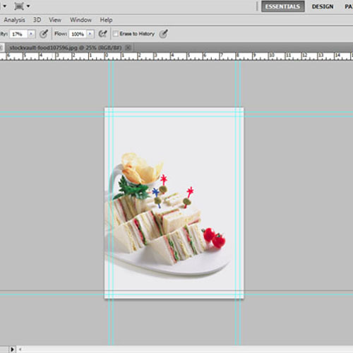
We will then draw margin lines on all four sides of the magazine cover of 0.25 inches so that our text is not at the edges.
Step # 7 – Design the masthead
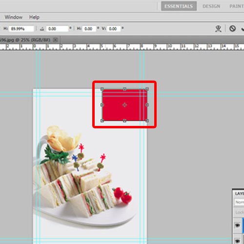
Once the image is set on the magazine cover in Photoshop we will design the masthead. First of all we will use the “rectangle tool” to draw a box at the top right corner. Change its color to red.
Step # 8 – Insert the text
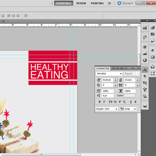
Now we will use type tool to insert the title name of the magazine which is also known as “masthead”. Then change the color to “ffffff” and font style to “Helvetica”. Place it over the rectangle. Draw white lines above and below the title. The masthead of the magazine is ready. If you already have a masthead, then you can simply place it on the cover.
Step # 9 – Draw rectangle
Now we will draw an elongated rectangle to fill the negative space. Change its color to red as well. You can use different pattern or artwork to fill the negative space on the cover.
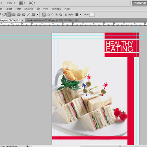
Step # 10 – Insert the details
Once done, we will use the “type tool” to insert the price and issue date of the magazine. The price and issue date are important pieces of information which must be placed on the cover. Use the “Franklin gothic” font and a size of “14 pt”. Change the color to black and place it at the top. You can change the placement according to the design layout.
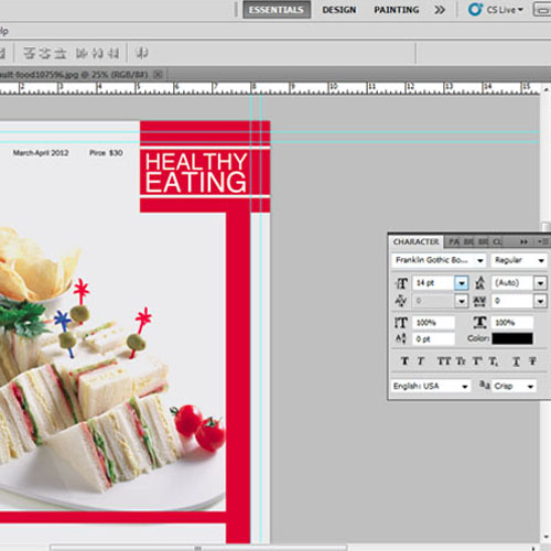
Step # 11 – Insert the Heading
Now insert the main article heading and change its font style to “minion pro”. You can increase its font size up to 60pt. Change its color as per your requirement. Over here the color used is green.
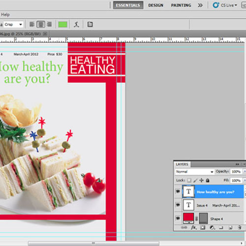
Step # 12 – Insert the text
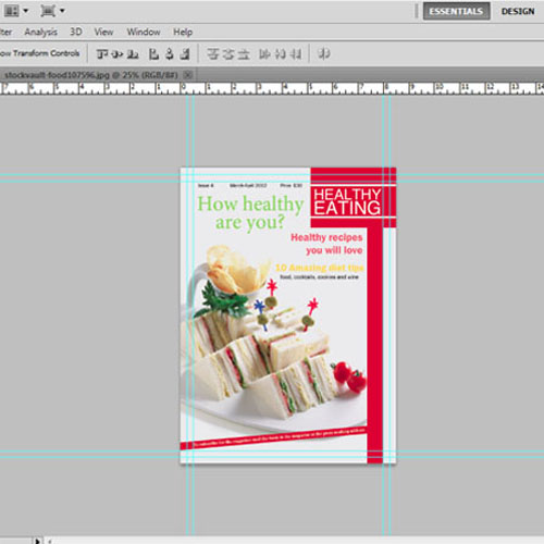
You can place a few more article titles in different colors and adjust their placement on the cover to create an interesting typography.
You can use this Photoshop tutorial to learn how to make a magazine cover and then use it to eventually create different designs.
 Home
Home