In this tutorial, we will teach you how to design a poster for a disco party in Adobe Illustrator.
Before you get started, you must get your hands on the following things:
Color paint splatter background 01 vector material
http://4-designer.com/2012/12/color-paint-splatter-background-01-vector-material/
Download the free stock vector material and separate the splatter objects from the background. We will be using these splatter objects and include them in the artwork.
Now let’s get started with the design.
Step 1 – Making the background
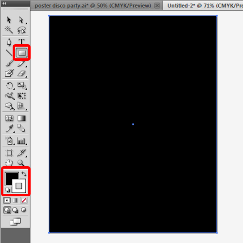
Let’s start by first creating a rectangle the same size as the canvas and filling it with black color.
Step 2 – Adding mesh lines
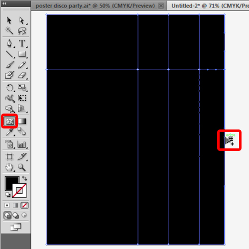
Now we will create a multi-colored background. For that, let’s pick up the mesh tool from the toolbar and add vertical and horizontal mesh lines by clicking on the shape here.
Step 3 – Adding color to the Mesh points
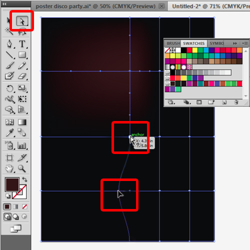
After that, switch to the direct selection tool and click on any mesh point that we created in the earlier step to select it. Now you can apply different colors to this mesh point. For that, all you have to do is select a color from the swatches while the mesh point is selected. It will automatically include that color in the mesh.
You can even alter each mesh point by dragging each placeholder using the direct selection tool.
Step 4 – Making a rounded rectangle pattern
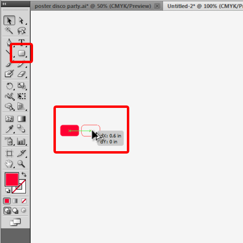
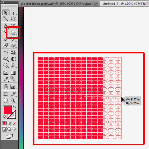
Over here, we will create a disco ball. For that, make a small rounded rectangle and fill it with red color. Now we will duplicate the rectangle to create a grid. What you need to do is duplicate the box while pressing the alt key and place it towards the right side. Now press Ctrl D and it will automatically make duplicates, in the same row keeping the same spacing which was left out initially.
Step 5 – Completing the grid
The same way, we will duplicate the grid vertically as well. Once done, let’s select all the boxes and resize them a bit, stretching them horizontally and reducing the size vertically.
Step 6 – Making a multi-colored grid
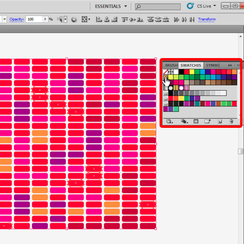
Next, we will select random rectangles from the grid and apply different colors to them. Use at least four or five different colors for the boxes.
Step 7 – Saving the pattern as a symbol
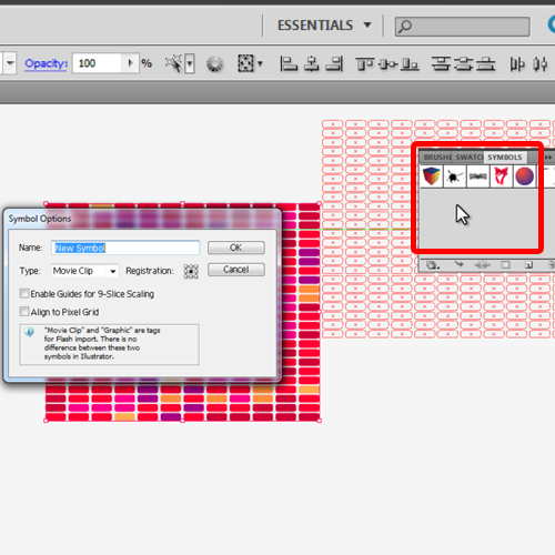
After applying the colors, select the whole grid and drag it to the symbol panel. It will save the whole illustration as a symbol. Now you can delete the grid from the canvas.
Step 8 – Applying 3D effects on a half circle
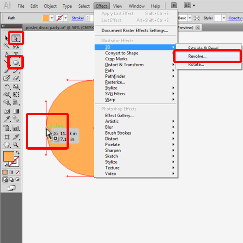
Next, let’s pick up the ellipse tool to draw a circle. After that, use the direct selection to remove this anchor point and make a half circle. With that done, go to the effects menu, move over 3D and select the “revolve” option.
Step 9 – Setting up the revolving options
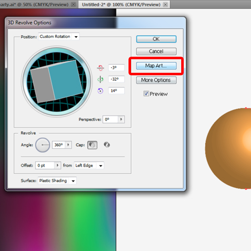
Over here, click on the preview option and now you can rotate the object while previewing the final result. Adjust the settings accordingly and click on the map art button.
Step 10 – Adding the grid pattern to the sphere
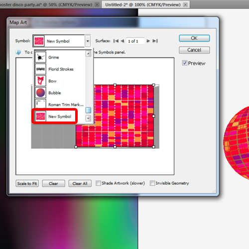
Over here, let’s open up the symbol drop down menu and choose the newly added symbol that we created earlier. With that taken care of, we have to position the symbol according to the sphere and once done, click on Ok. Now the multicolor sphere is now ready.
Step 11 – Giving a backdrop to the sphere
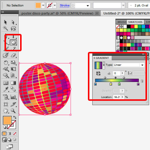
Next we will draw a circle the same size as the sphere using the ellipse tool. Now let’s send it to back by pressing the “Ctrl+Shift+[“ key. After that, let’s position it behind the sphere and open up the gradient window. Over here, we will take different colors from the swatches and make a vibrant colorful gradient. This will give a backdrop to the multi-colored sphere.
Step 12 – Expand Appearance
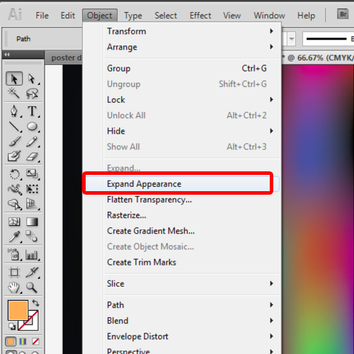
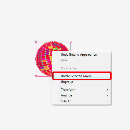
Once done, select the sphere which is in the front, move to the “objects” menu and click on the “expand appearance” option.
Step 13 – Isolate the Selected Group
With that done, right click on the sphere and ungroup it.
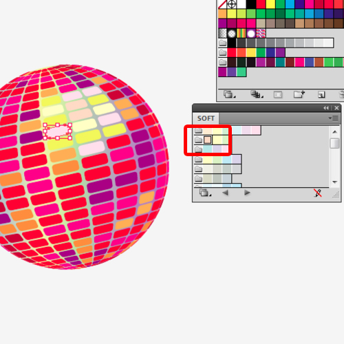
Step 14 – Creating a highlighted area
Now let’s change the color of the rectangles towards the top to create a highlighted area.
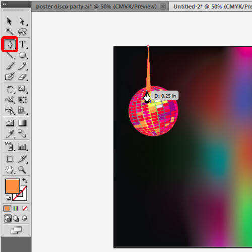
Step 15 – Adding the disco ball to the poster
The disco ball is now ready. So simply select it and place it over the canvas. Over here, we will use the “pen tool” to draw a simple illustration of a string connecting the disco ball and move it behind the illustration.
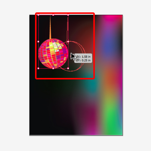
Step 16 – Duplicating the disco ball
After that, let’s duplicate the disco ball and place it right next to the original illustration. You can adjust the artwork accordingly.
Step 17 – Adding paint splashes
With that taken care of, we will add paint splash to the poster. For this tutorial, we will use vector stock graphics for this purpose.
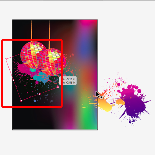
Like we suggested earlier, separate the splashes from the original artwork and bring them on to the canvas. Now we will simply select each splash object and place it on the canvas, changing the size of each object and positioning them behind the disco balls. You can play around with the concept a bit and see what you can come up with.
Step 18 – Adding sparkles
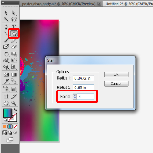
Once done, let’s add sparkles to the artwork. For that, select the star tool and draw a star with 4 points.
Step 19 – Configuring the colors and positioning the sparkles on the disco balls
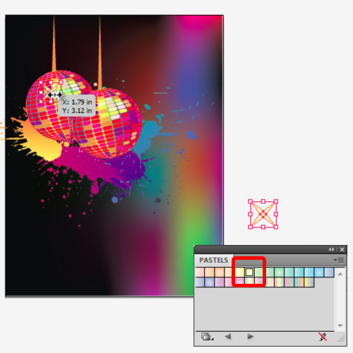
Fill it with light yellow pastel colored gradient and place it over the disco balls. Keep duplicating the star and place it randomly over the disco balls.
Step 20 – Adding the text
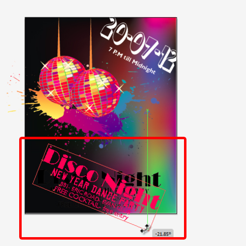
Finally, insert the text using the type tool. For this tutorial, we have used Chocolate Drops NF for the date and LTC Broadway Regular for the main heading. For the details we have used different font types from Gill Sans MT to Myriad Pro. It’s important to mix it up a bit to create interesting typography for the poster.
Lastly, we will position the text on the canvas, and tilt it, keeping the date and time at the top while placing the details below the disco balls. For the text, we have kept the font color to white and with that taken care of, our poster is now complete.
 Home
Home