In this tutorial you will learn to create and customize charts in Excel for iPhone and iPad. You will also learn some of the limitations for charts found in the iOS version compared with the desktop equivalent.
Step # 1 – Selecting a range of cells
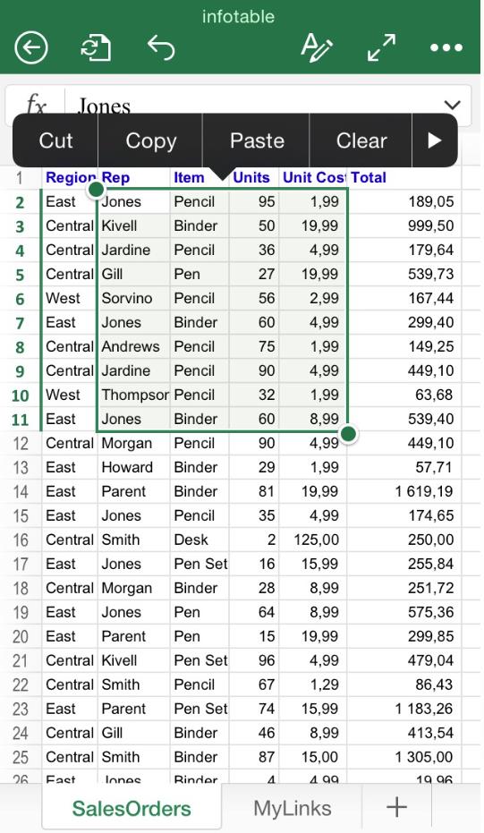
The first step is selecting the elements you would like to be displayed in the chart. Tap a single cell, and drag the green box using the circles in the corner until all the data desired is inside the highlighted area:
Step # 2 – Enter the “Insert” menu
Once the range is defined, the following action is finding and clicking the “Insert” menu. As before, depending on the device you are using, this step change slightly:

Find the ribbon button , and then look for the “Insert” option.
Step # 3 – Finding the “Charts” option
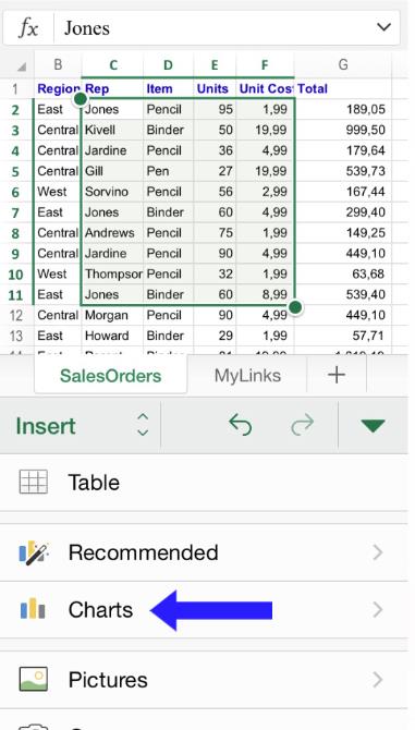
Once you are inside the “Insert” menu, look for the option “Charts”. Again, please be sure that the desired range is selected within the green square.
Step # 4 – Choose the right chart
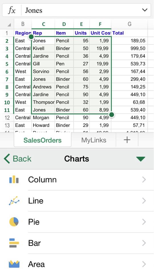
Once you have clicked “Charts”, you will find a number of predesigned options to pick from. Some parameters can be customized later, and you will have the chance to choose both plain and three-dimensional charts:
Step # 5 – Obtaining a chart
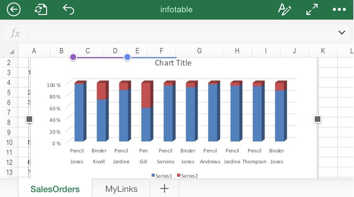
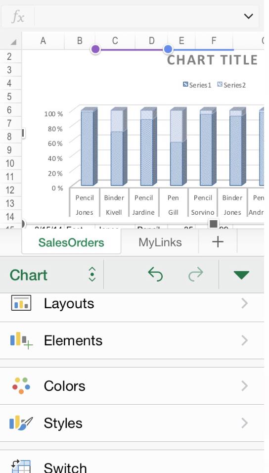
Once you have decided from the pool of chart options, the chart will be automatically generated. You can also resize it using the gray squares in the corner.
Step # 6 – Modifying the chart
If you come back to “Insert / Charts”, you will see some customization options available. Unfortunately, only “Layouts”, “Colors” and “Styles” can be changed in the free version. For customizing “Elements”, which includes changing Axis and Chart titles, you will have to acquire the paid version.
 Home
Home