In this tutorial, you’ll learn a few easy tips that will allow you to ensure that your documents in MS Office will be equally understandable for people who are colorblind, and those who have full vision.
Step # 1 – Avoid Color
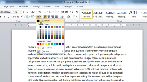
This is a pretty blatantly obvious one, but simply avoiding the use of unnecessary color. When you do need to use color, make sure you label it properly. An example of this is if you had a picture of a green rectangle, then you should label it as a green rectangle.

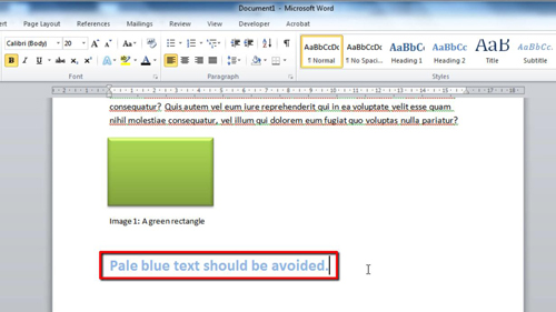
Step # 2 – Avoid pale blue text
The most common form of colorblind deficiency or just eyesight degradation in general, is with the color of pale blue. Simply avoiding this text color will really help out.

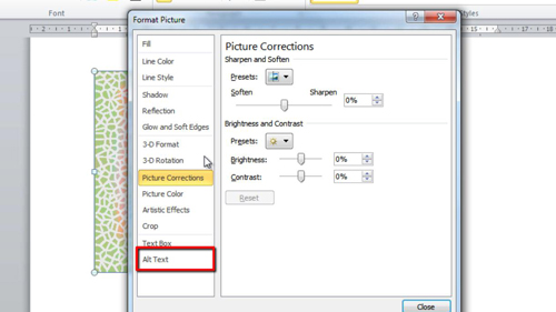
Step # 3 – Incorporate ALT text
When it comes to images, especially ones with color, people with colorblindness or eyesight degradation often struggle. A great way to help with this is by using ALT text, which is that bit of information that appears when you hover over an image. This is done by right-clicking the object, clicking “Format Picture”, and then clicking on Alt Text. Enter something helpful about the colors of the image here. That’s all, you now know three easy ways to make MS office a bit easier for colorblind people.

 Home
Home