Excel sheets usually contains a lot of data and in order to go through all that data it takes time. Hence, you can create graphs in Excel. Graphical representation of the data can help the viewer save time. Also from it people can easily understand the results of something just by having a glance. Comparisons can be made between different months or products. Over here the numbers are replaced by column bars or lines so that the viewer can see which the longest bar is. Detail is written at the corner of the chart for understanding what does the vertical or the horizontal axis mean.
Follow this step by step tutorial to learn how to create a column chart in Excel fairly easily.
Step # 1 – Insert column chart
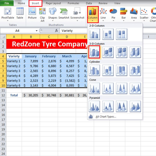
In this tutorial we have data of four months, from January to April and we have six varieties. In order to add a column chart first we have to select the data. When doing this you have to make sure that the total column is not selected otherwise the chart will not come out to be correct as the values will be doubled. After selecting the data click on the “insert tab”. Then go to the “charts” group and click on the “column” button. From the drop down menu select the first option under the “3-d column” heading.

Step # 2 – Choose Chart Style
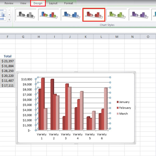
When the chart gets inserted, the values in the sheet which were inserted in it are linked to it. Any changes that you make in the values will be reflected on the chart. Suppose that the fourth month, which is “April” in this case, has to be removed from the chart. Click anywhere in the data and then click on the right corner of the blue line and drag it till “March”. The data of the month of “April” will be removed from the chart. Cell “D9” contains a negative value, if you double click on the cell and remove the negative sign from it, the bar of “variety 5” will point upwards. Therefore, after you create a column chart in Excel you can make changes in your data and the chart will get changed accordingly. When you will click on the “Chart”, 3 new tabs will appear. Click on the “design” tab and from there you can choose the different chart styles.

Step # 3 – Insert Chart in a new sheet
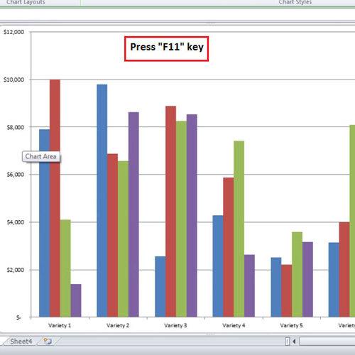
Although the size and the position of the chart can be adjusted when you insert it, you still might want the chart to be displayed in a new sheet. In order to do that, select the data range and then press the “F11” key. The chart will now be inserted in a new sheet. The sheet’s name, by default, will be “chart 1” which can be changed later.
It is very easy to create graphs in Microsoft Excel and in turn they help you to view and analyze your data more efficiently.

 Home
Home