A pie chart, also known as a circle graph, is used to show percentages. A whole circle represents 100% and then it is divided into slices which represent portion of the total. Using a pie chart in Excel helps the person to know the data just by having a glance at it. The biggest piece can easily be noticed. You can even use other things like labels and percentages that can be written on the diagram.
Follow this step by step tutorial to learn how to create and modify a pie chart in Microsoft Excel easily.
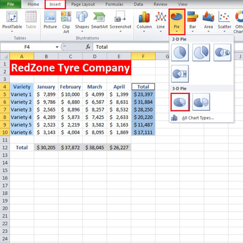
Step # 1 – Insert the Pie chart
In this tutorial we have an Excel worksheet which has monthly data from January till April and is divided into 6 varieties. In order to create a pie chart we need to select the “variety” column and the “total” column. After selecting them click on the “insert” tab and go to the “charts” group. Click on the “Pie” button and from the drop down menu select the first option which comes under the “3-d pie” heading.
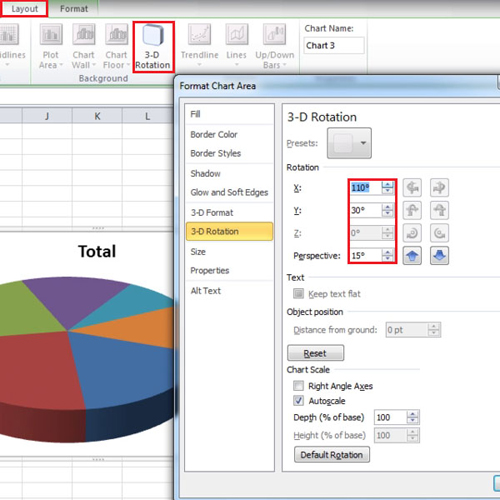
Step # 2 – Rotate the chart
After the Pie has been inserted you will see that each color represents a different variety. The red slice represents “variety 2” and since it has the largest value its size is bigger. If you want “variety 2” to appear at the front then, click on the chart and go to the “layout” tab. In the “background” panel present on this tab click on the “3-D rotation” option. A box will open from where you can change the degrees of the “x” axis in order to make the red slice come in front and the “y” axis to make the chart easily viewable. After you are done with it, click on the “close” button to exit.
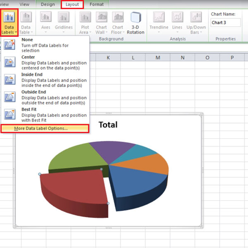
Step # 3 – Click on Data labels button
Since we want to make “variety 2”, which is represented by a red slice, more prominent then the rest of the slices, click on the chart and when all the pieces gets selected click on the red slice. Now only red slice gets selected. When the red slice has been chosen, click and drag it outwards. In the “layout” tab go to the “Data labels” option and from the drop down list select the “more data labels options” button.
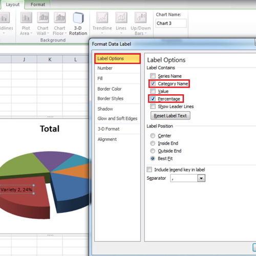
Step # 4 – Add Data labels
If you want to add data labels to only one piece in the pie chart in Excel then make sure only the slice is selected. When you select the “more data labels” option a new box will open. Uncheck all the categories which are under the “label contains” title. From here, select “category name” and “percentage” only. When you do that the name of the category along with the percentage it represents of the total output will be displayed on that particular slice. After adding “percentage” and “category name” to the biggest slice, select the rest of the pie chart and add only “percentage”. This will differentiate them with the slice which has the biggest value.
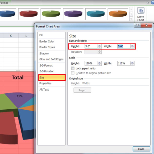
Step # 5 – Change the format of chart
After you are done adding the tables in Microsoft Excel then double click inside the chart box and the “format chart area” box will open. Once the box opens, go to the “fill” tab and from there you can set the background color of the chart and you can even change the transparency level. If you click on the “size” tab, the height and width of the chart can also be adjusted.