In this tutorial, we will teach you how to create a save the wildlife poster.
Before we get started, you should get your hands on as many grunge patterns as you can. For this tutorial, we will be working with three basic grunge patterns and giraffe stock images.
Below are the links to the resources we will be using:
Subtle grunge texture
http://www.stockvault.net/photo/129964/subtle-grunge-texture
Blue Watercolor Texture 1
http://shembre.deviantart.com/art/Blue-Watercolor-Texture-1-256051488
Black and white grunge texture
http://www.sxc.hu/browse.phtml?f=view&id=1367734
Giraffe
http://www.sxc.hu/browse.phtml?f=view&id=198800
http://www.sxc.hu/browse.phtml?f=view&id=%20758308
http://www.sxc.hu/browse.phtml?f=view&id=1347432
Step 1 – Making the background
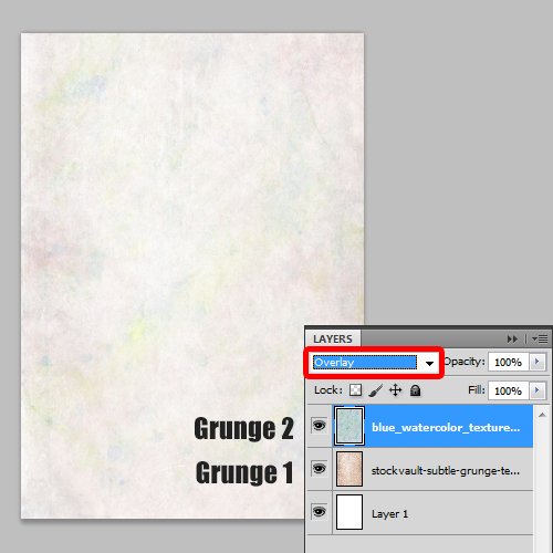
Now let’s open up a blank document in Photoshop and add the first grunge pattern on the canvas, the subtle grunge texture. You can adjust the size to fit the canvas. With that done, we will add the watercolor textured paper and adjust its size to fit in the canvas as well. Next, we will change the layers mood to “overlay”.
Step 2 – Adding the giraffe image
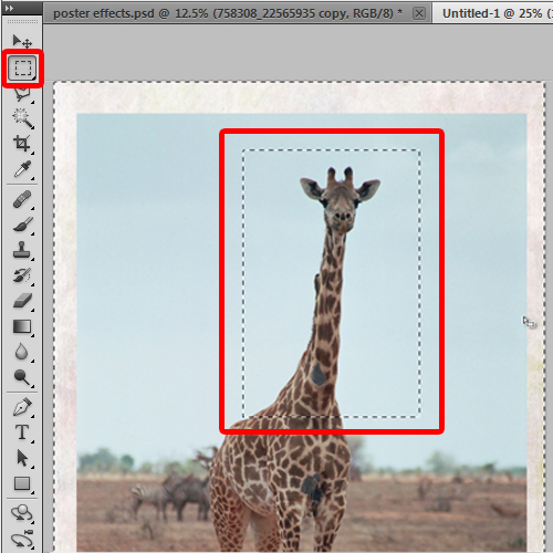
Now we will add the animals to the poster. Let’s select the first giraffe image and bring it on the canvas. Over here, we will use the selection tool to make a rough selection of the animal from the neck up. With that done, we will make an invert selection and delete the rest of the image.
Step 3 – Removing the background
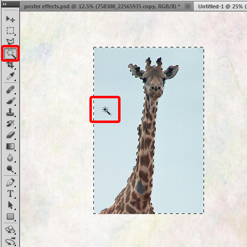
Since the background now is a static blue color, we will use the magic wand tool to remove the background. If you want a more accurate output, you can use the marquee tool for this as well.
Step 4 – Using curves adjustment to blend the image
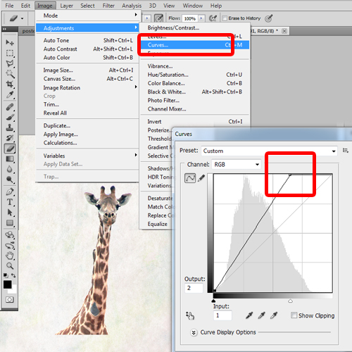
Notice that the image lighting and exposure is dull and doesn’t match with the background. Therefore, let’s move to the Image menu, move to Adjustments and select the Curves option. To add white balance, we will take the top placeholder and move it towards the right side. You can play around with this feature to make the giraffe fit in with the background.
Similarly, we will add two more images of giraffes and use the same techniques to crop out the images from the neck up and adjust the lighting and exposure for each image.
Step 5 – Using the wind filter
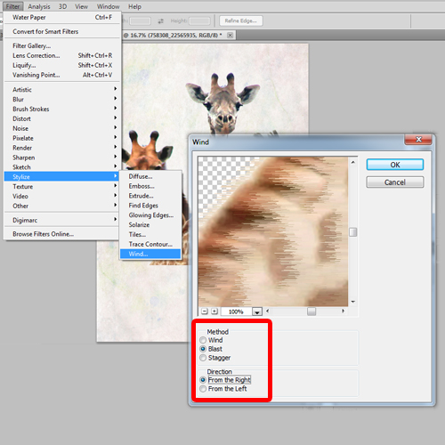
Now let’s select the image layer and go to filter, select stylize and then choose the wind option. For this tutorial, we will select blast for the method and set the direction “from the right”. With that done, let’s apply the same filter on the rest of the image layers by selecting them and pressing “Ctrl+F”. This shortcut automatically applies the last filter used on the selected layer.
Step 6 – Brushing out the edges
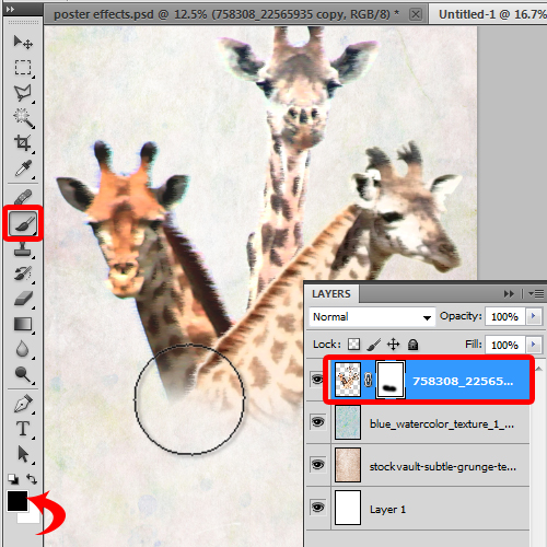
Once you are satisfied with the results, select them all and press “Ctrl+E” to merge them into a single layer. Right now, the bottom of the image is sharply cut and isn’t fitting in well. For that, we will use masking to remove the edges at the bottom so that it blends in well with the background.
Step 7 – Adding more grunge patterns
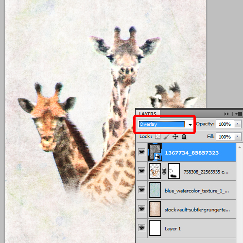
Lastly, we will open up the black and white grunge texture and adjust the size to fit in the canvas. With that done, let’s change its layer mode to “overlay”.
Step 8 – Adding blue color
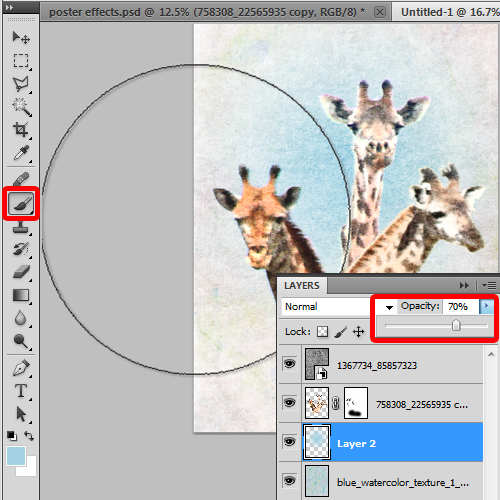
Next, let’s create a new layer below the image layer and use a soft brush to apply blue color in the middle of the canvas. The color fill used here is “a4d2e3”. Let’s change the opacity of the layer to 70% and we are done with the illustration.
Step 9 – Adding the text
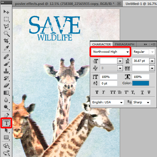
Now it’s time to add the text. For this, we will pick up the type tool, use Northwood High for the font and insert the text on top of the poster. We have structured the text in such a way that the size of the word “Safe” is larger than the rest of the text.
At the end, let’s change the color of the text to “0a77af” and our wildlife poster is ready.
 Home
Home