In this HowTech tutorial, we’re going to show you how to graph functions in Excel 2016.
First, we need to create a table of values. As of yet, there is no functionality to graph a function by the equation alone.
We start with the x-coordinate as shown below.
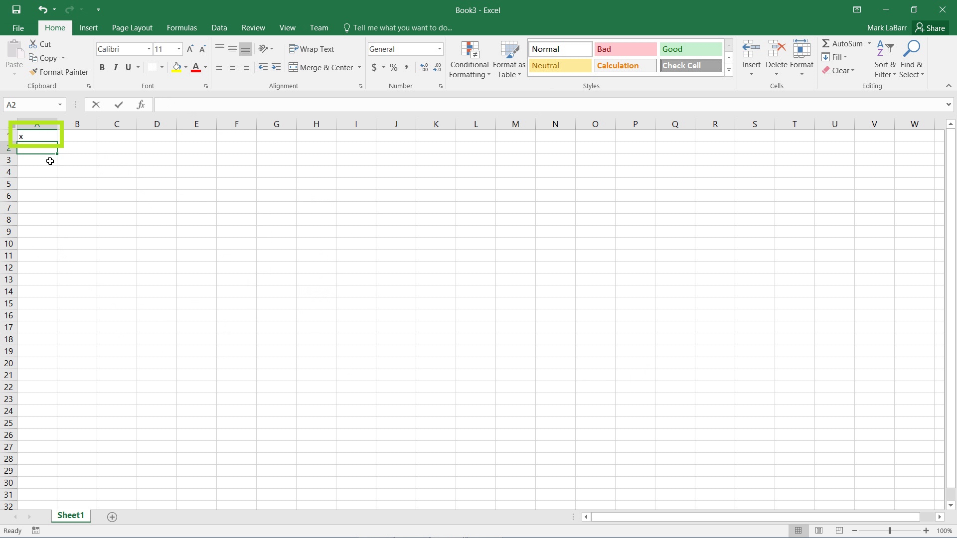
Then, for example I want values from 0 to 10, I would simply type 0 in a row, and in the next row a 1. Highlight the two cells and hover the mouse over the small square in the bottom right of the selection until the cursor changes to a plus sign. Click and drag the selection downwards as shown below.
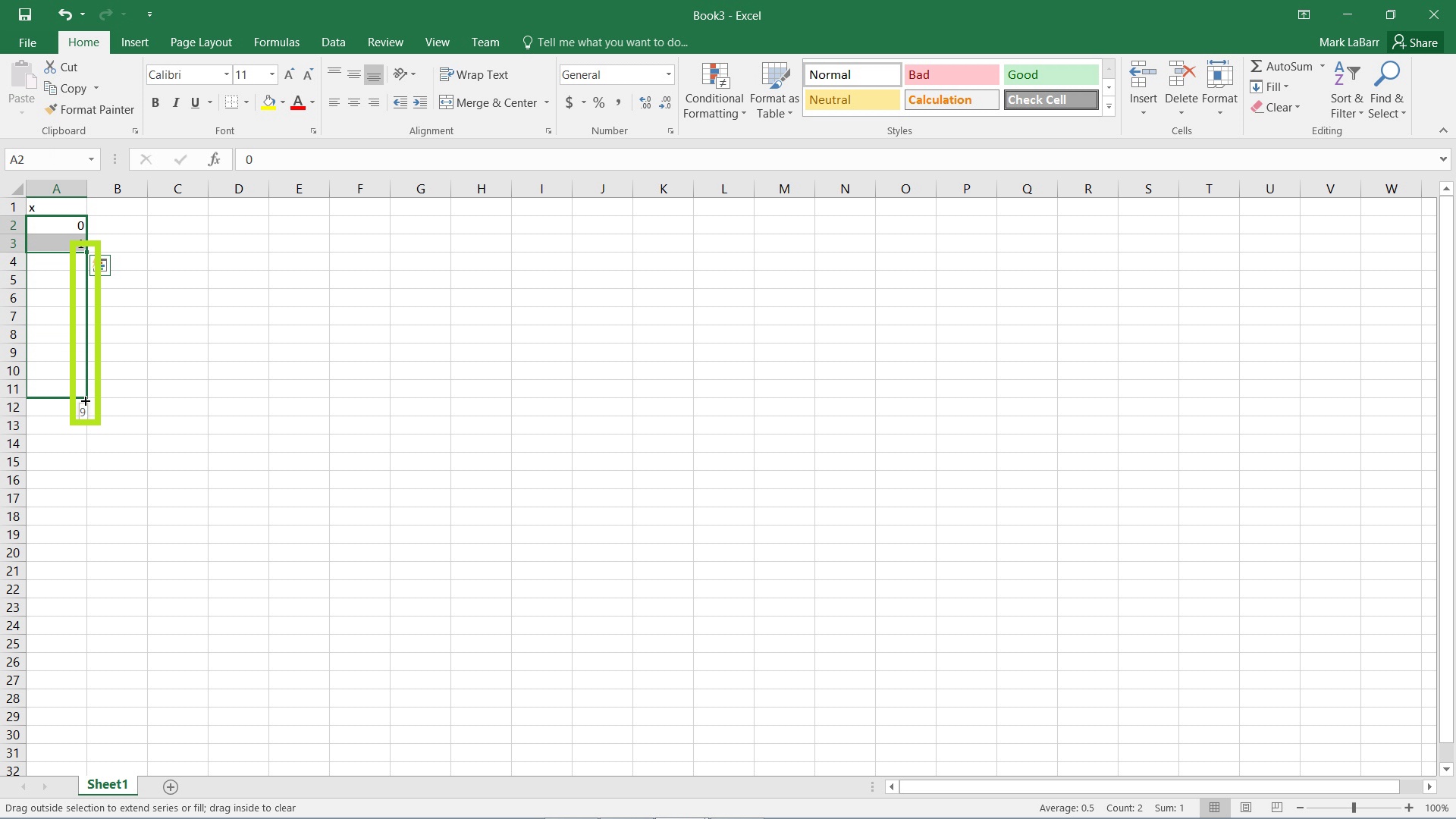
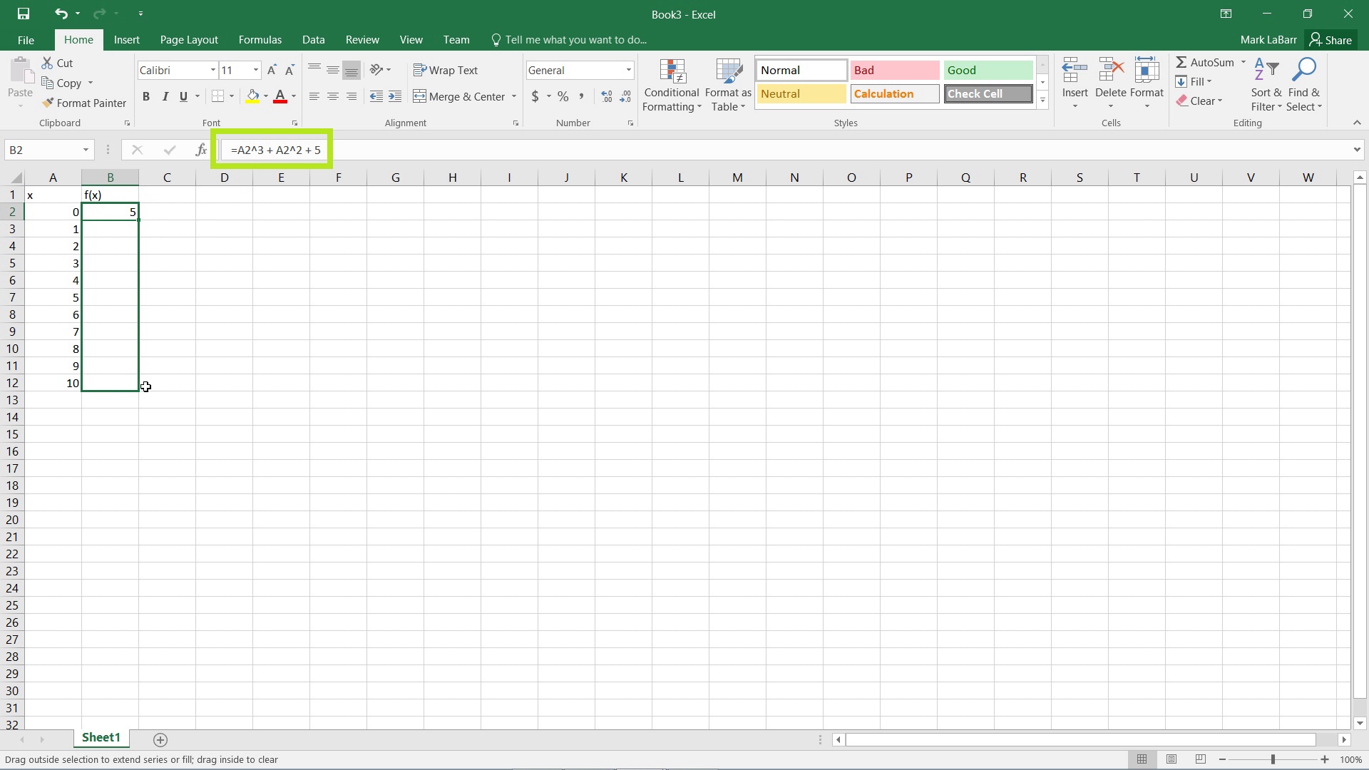
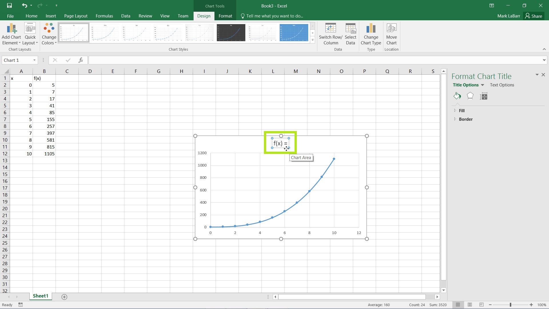
You should now see values from 0 to 10. We’ll now create the f(x) or y-coordinate table. Type in the equation you want in the formula bar highlighted below, or into the corresponding cell. The equation I used is as follows: =A2^3 + A2^2 + 5. The A2 cell being the corresponding x value. Now drag the equation down by dragging the small square in the bottom right of the selection as we did earlier and shown below to copy the equation to all x values.
Now to graph the equation, select the entire typed table and go to the Insert tab, click Scatter and click Scatter with Smooth Lines and Markers.
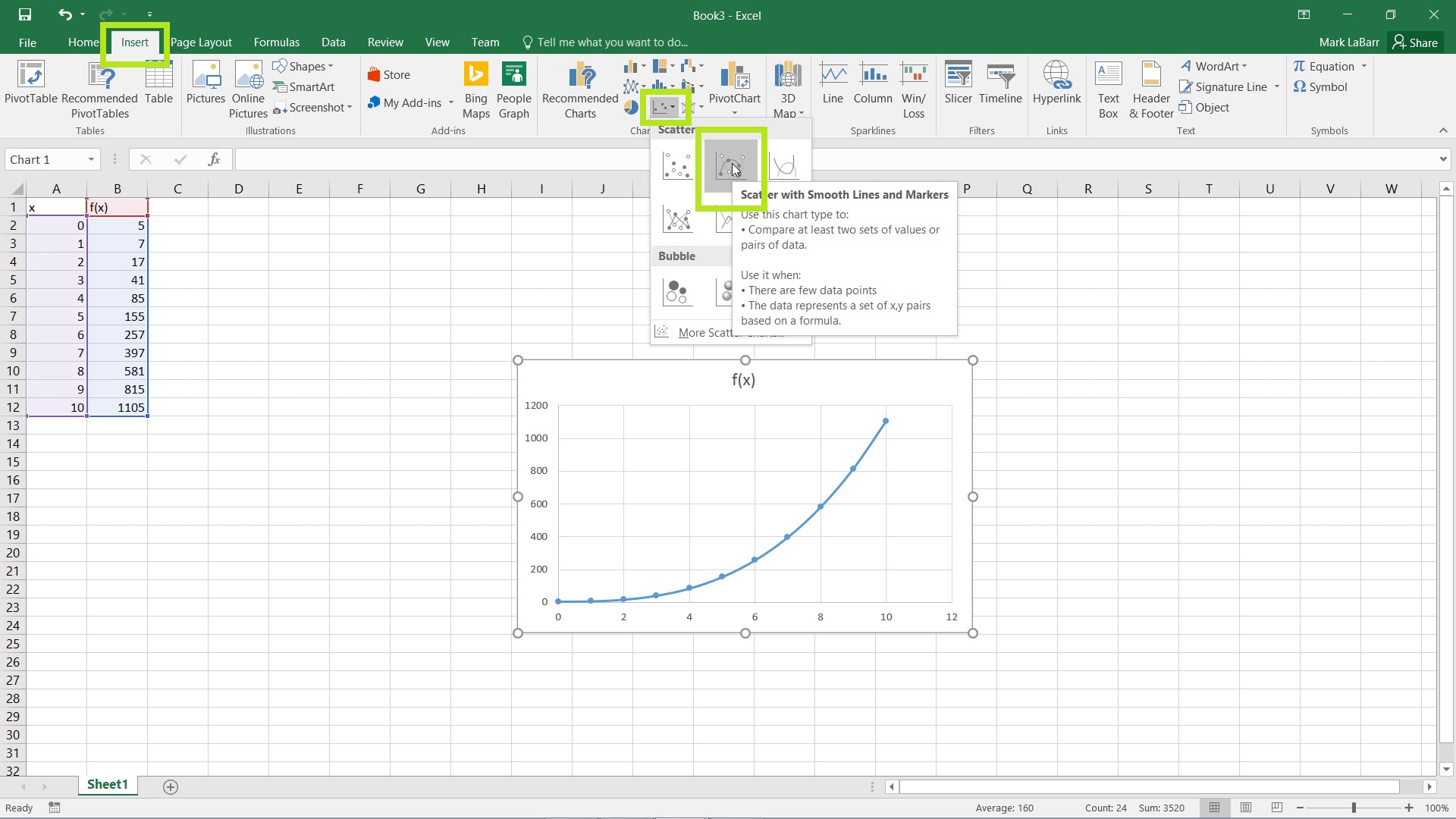
Your graph should now appear and be set. You can also change the title of the graph by clicking on the field and typing whatever you want in the text box.
 Home
Home