In this tutorial, we’re going to show you how to create charts in Excel 2016.
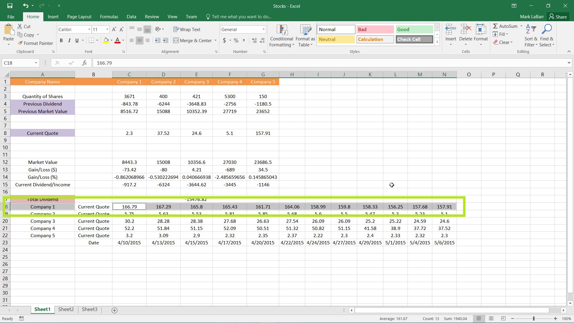
To get started, select your data to use for the chart. In the example below, I’ve selected the Company 1 cell, and then held Ctrl and selected the other cells excluding Current Quote. Thus, my title will be Company 1, and it will plot the data points selected.
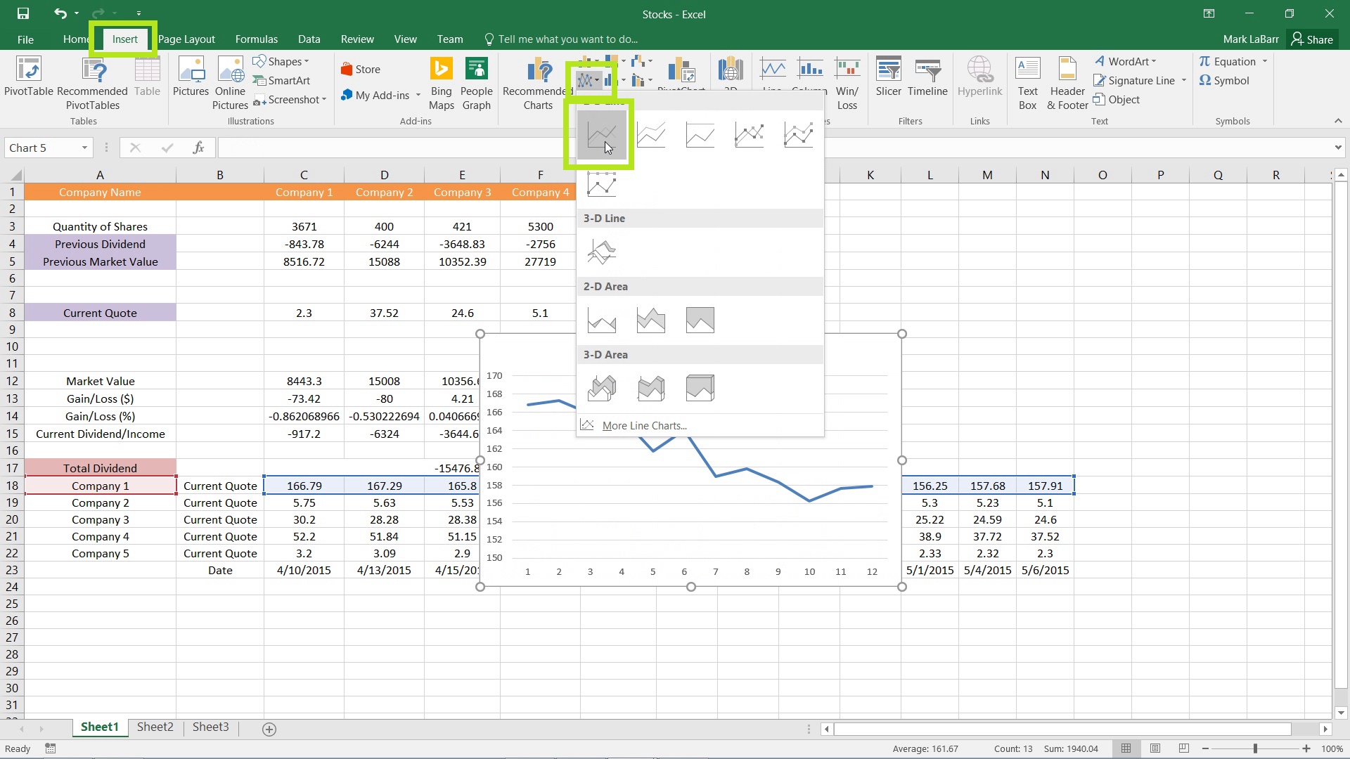
Go under the Insert tab and find the graph that suits your needs.
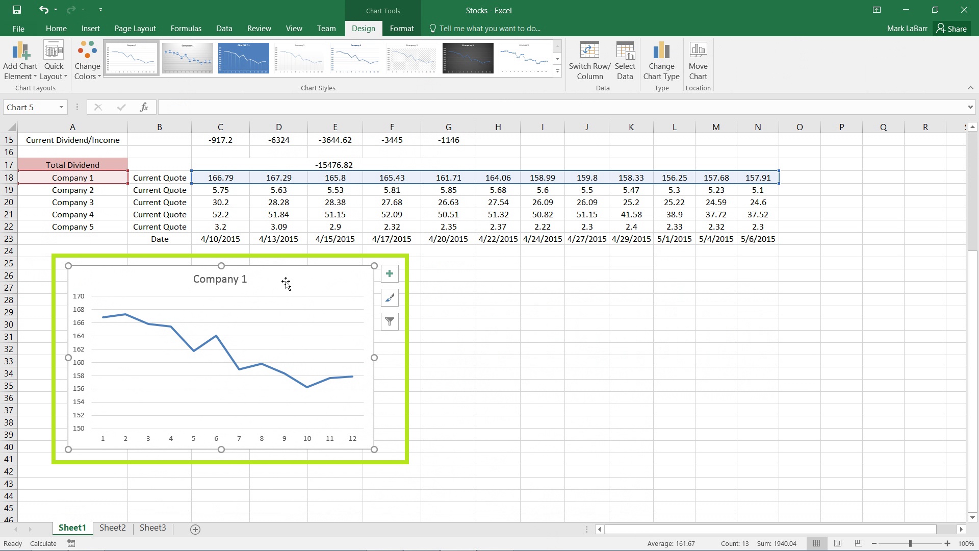
Your graph should now have been inserted. Hover over it until the cursor changes as shown below, then click and drag to position it wherever you want it.
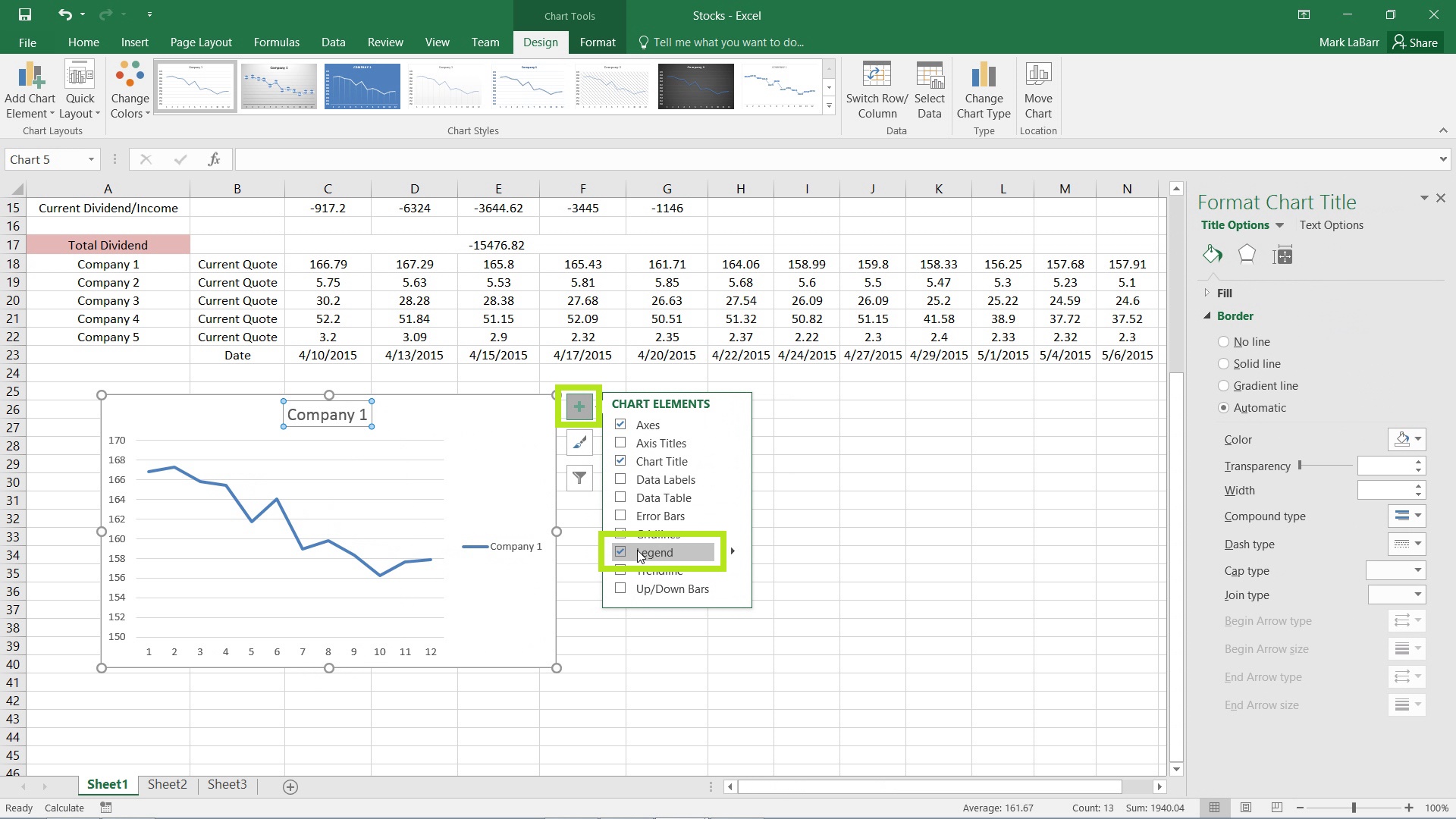
If a chart element that you want is not on the chart, or you want to remove an element, click the plus sign over to the right of the chart and make your changes.
To change a certain element (the Legend for example), right-click it and click Select Data…
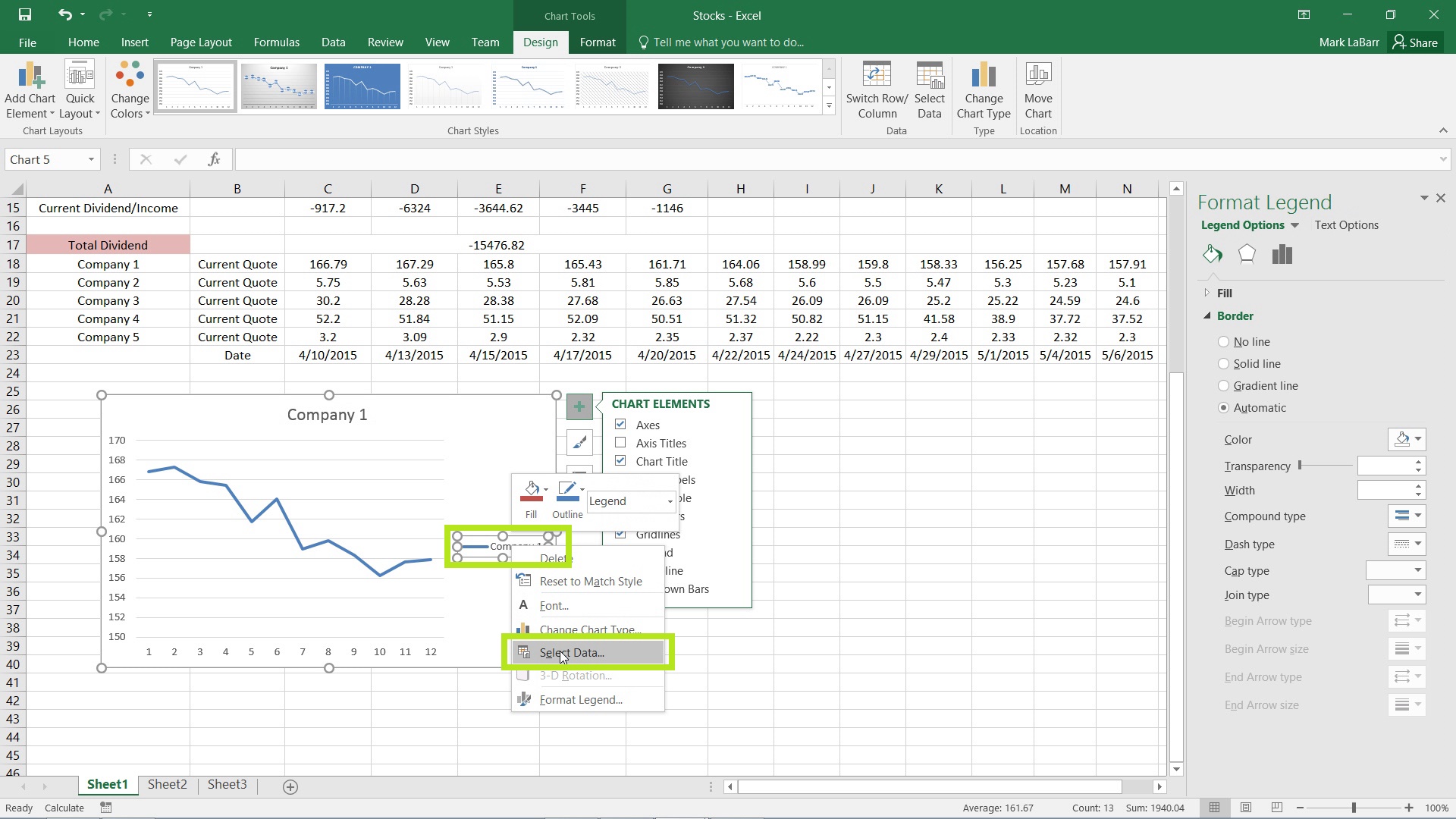
Then click Edit as shown below. The Edit button on the left, which corresponds to the Legend.
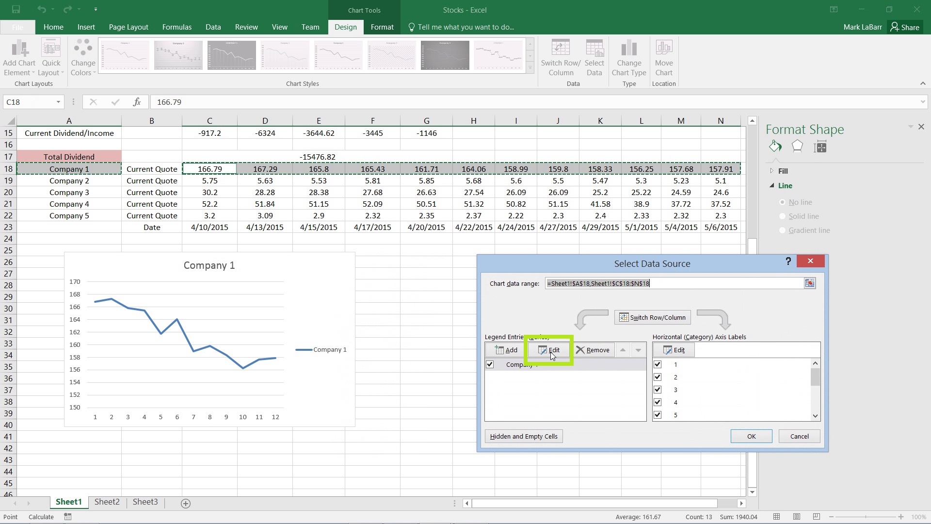
Then simply select the cell(s) for the data. In this case, the Legend uses a single cell, so I selected Current Quote as the value for the Legend.
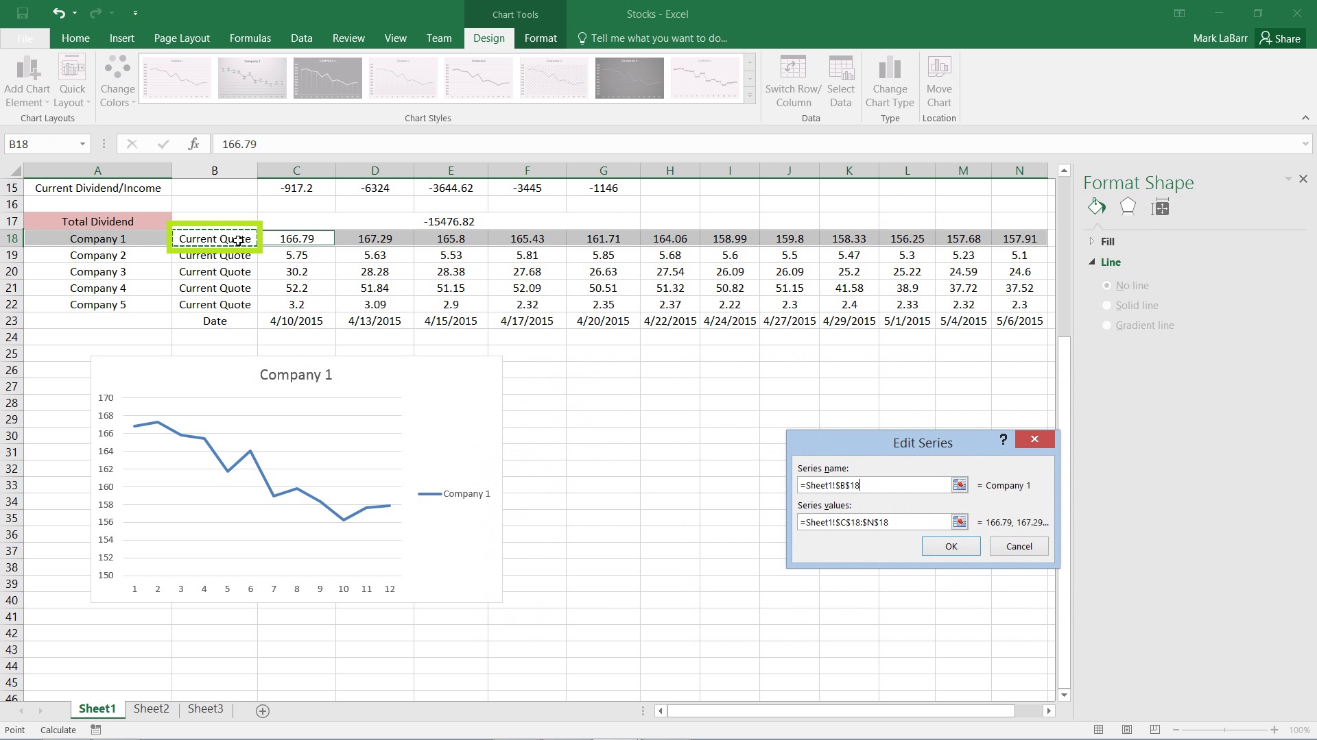
If you wanted to change the x-axis values to dates or anything else, simply right-click on the axis and hit Select Data…
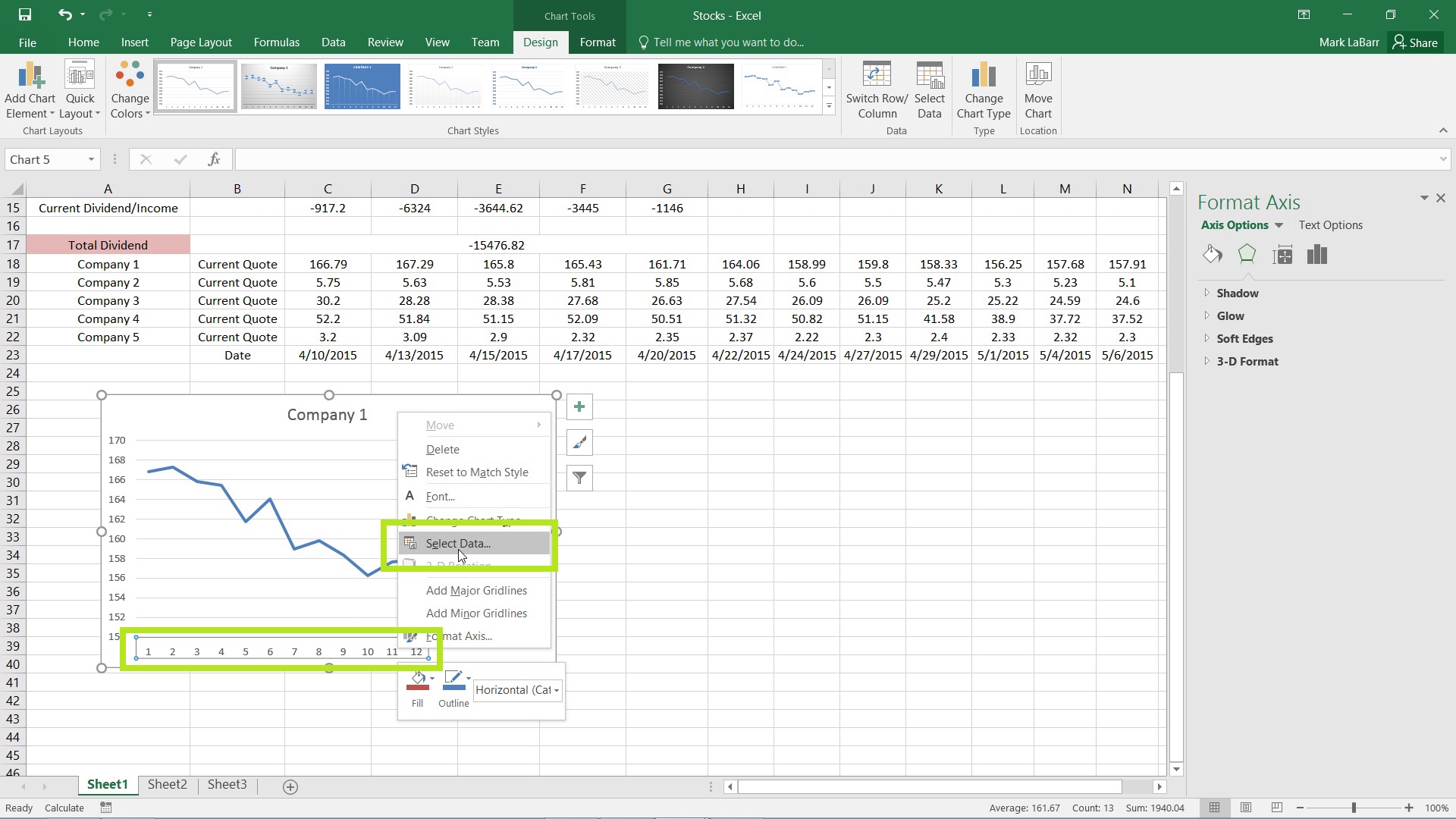
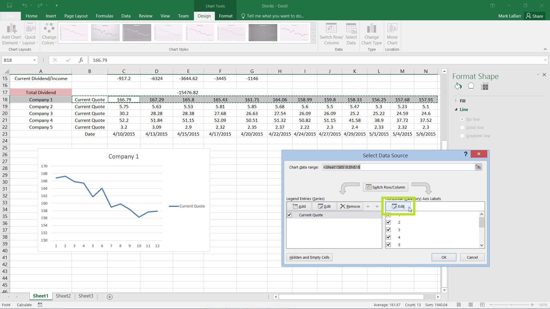
Then click the Edit on the right side, which corresponds to the x-axis.
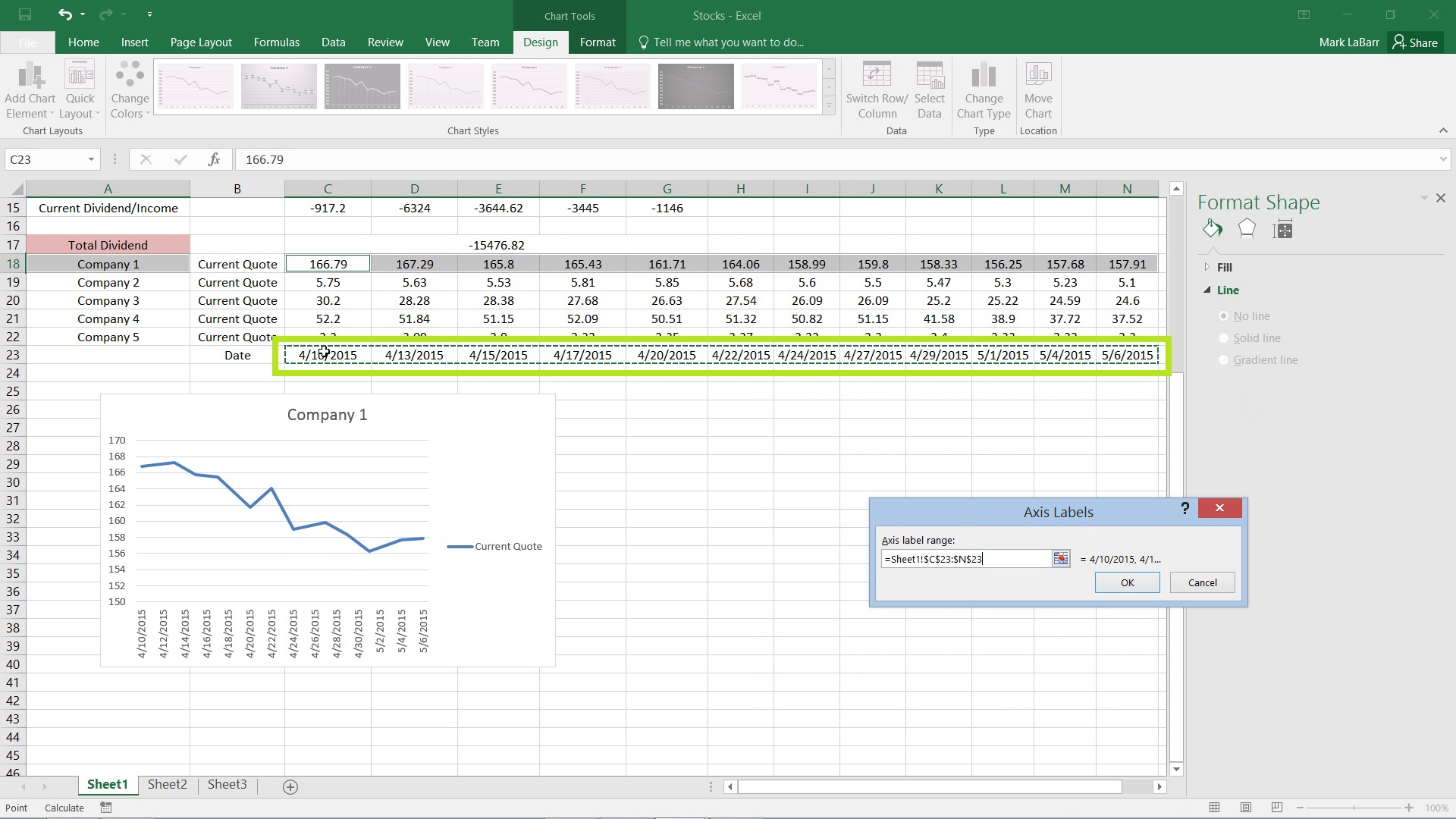
Select the data range to use. For this example, I have the dates already typed out. This is helpful because the same data range can be reused for multiple charts.
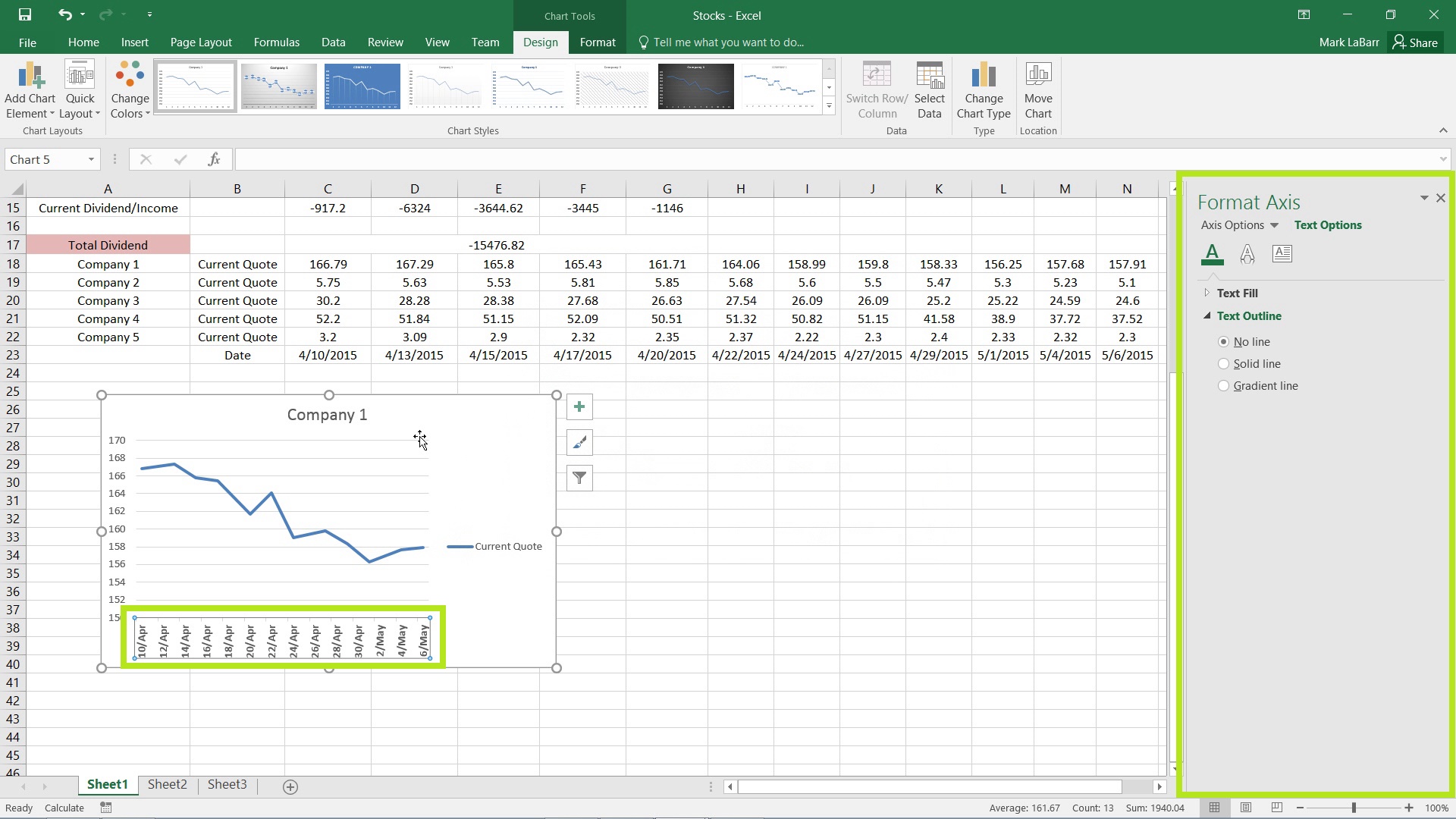
To change the format of the axis, select it in the chart and use the options in the menu to the right which is highlighted below.
 Home
Home