In this final part of the tutorial, we will give you a basic idea to add effects on a web page. Different Photoshop patterns can be created through these effects. You will also learn to choose fonts and their colors according to the design and layout of the background. By completing all three pats of this tutorial, you will surely be able to design and developed a complete web gallery layout from scratch.
You can even further stylize the layout by designing and customizing it yourself. An additional effect that can be used to decorate it can be done with the help of Photoshop brushes.
Follow this step by step guide to learn how to add effects on a photo gallery layout in Photoshop.
Step # 1 – Adjust the Drop Shadow of the Buttons
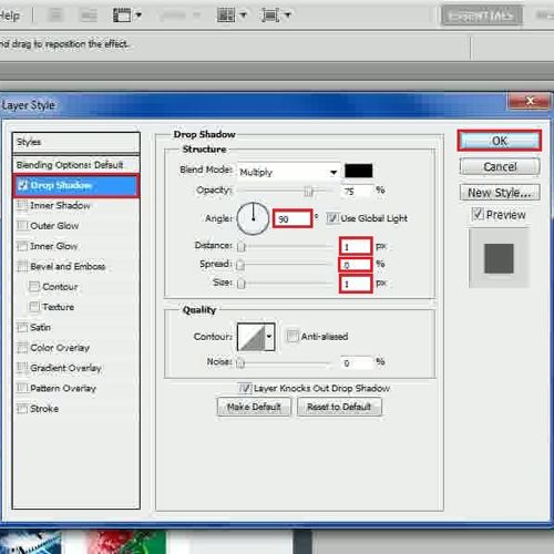
In the first step, launch Adobe Photoshop and load the layout which we created in the previous part. Now select the “Home” button layer, open its blending mode and move over to the “Drop Shadow” tab. Set its angle to “90 degrees”, distance to “1px”, spread to “0 percent” and size to “1px”. Once done, click on the “OK” button to apply it. Similarly copy the layer style and apply it on the rest of buttons.
Step # 2 – Adjust the Gradient Overlay of the Category Head
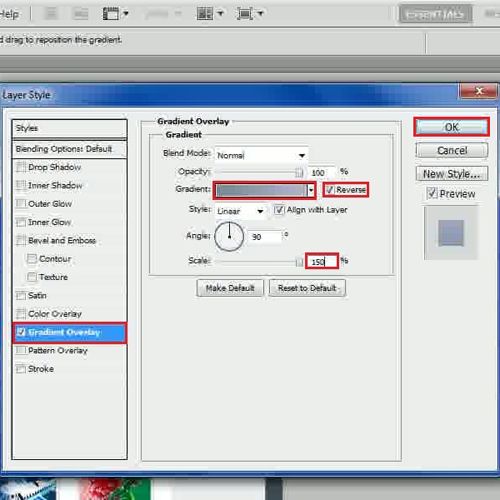
In the next step, move over to the “Side bar” group, expand the categories option and go to the blending options of the “Head” shape layer. Next, click on the “Gradient Overlay” tab, select the “Gradient” option and choose “b3b3cc” color for the left and “728da0” color for the right side of the gradient. Once done, select the “Reverse” option, increase the Scale to “150 percent” and click on the “OK” button to apply it.
Step # 3 – Adjust the Gradient Overlay of the Category Menu
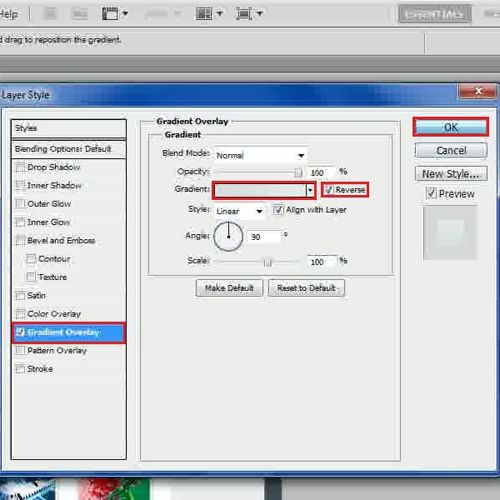
Now in this step, move over to the “List” shape layer, open its blending options and click on the “Gradient” option. Choose “e2eeee” color for the left and “d8dde0” color for the right side of the gradient and select the “Reverse” option. Now set the Scale to “100 percent” and click on the “OK” button to apply it. In the same way, apply these blending options on rest of the category menus.
Step # 4 – Adjust the Outer Glow of the Add Space
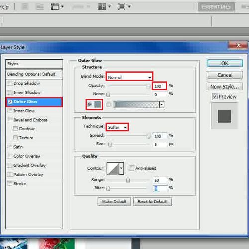
Go to the “Add Space” layer, open its blending options and click on the “Outer Glow” tab. Now choose the blending mode to “Normal”, opacity to “100 percent”, noise to “0 percent” and choose the color as “e6f0f4”. Once done, choose the technique to “Softer”, spread to “100 percent”, size to “5px”, range to “50 percent” and jitter to “0 percent”.
Step # 5 – Adjust the Stroke Settings of the Add Space
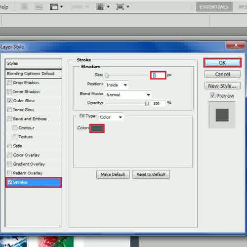
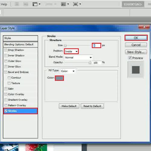
Now move over to the “Stroke” tab, set its size to “1px” and position to “Inside”. Once done, choose the color as “b6c1c6” and click on the “OK” button to apply it.
Step # 6 – Decrease the Opacity of Add Space
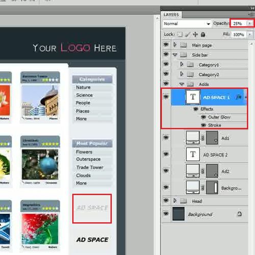
After applying these effects, decrease the opacity of this layer to “25 percent” and apply same settings on the other “Add Space” layer.
Step # 7 – Adjust the Drop Shadow for the Background
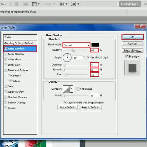
Now select the “Background” layer of the side bar, open its blending options and move over to the “Drop Shadow” tab. Choose the blending mode as “Normal”, set the opacity to “40 percent”, angle to “90 degrees”, distance to “5px”, spread to “0 percent”, size to “10px” and click on the “OK” button to apply it.
Step # 8 – Adjust the Drop Shadow for the Label
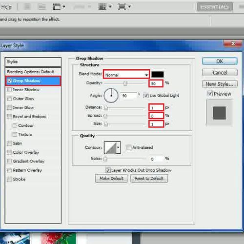
In the next step, move over to the “Main page” group, expand the “Img1” category, select the heading text layer and open its blending options. Now move over to the “Drop Shadow” tab, change its blending mode to “Normal”, opacity to “50 percent”, distance to “1px”, spread to “0 percent” and size to “1px”.
Step # 9 – Adjust the Color Overlay
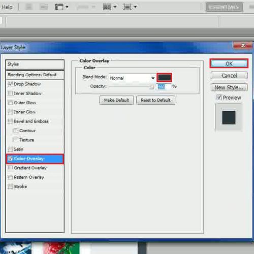
Now move over to the “Color Overlay” tab, choose the color as “28373e” and click on the “OK” button to apply it. Once done, apply these settings on all other text layers.
Step # 10 – Adjust the Drop Shadow for the Label
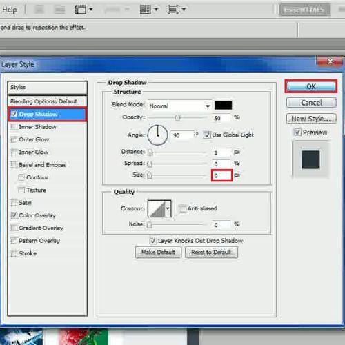
Now open the blending options of the main category’s text layer. Move over to the “Drop Shadow” tab, set its size to “0px” and click on the “OK” button to apply it.
Step # 11 – Adjust the Gradient Overlay for the Head
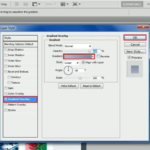
In the next step, open the blending options of the “Head” shape layer and move over to the “Gradient Overlay” tab. Now select the left gradient to “b3b3ce” and right gradient to “728da0” and click on the “OK” button to apply it.
Step # 12 – Adjust the Stroke Settings
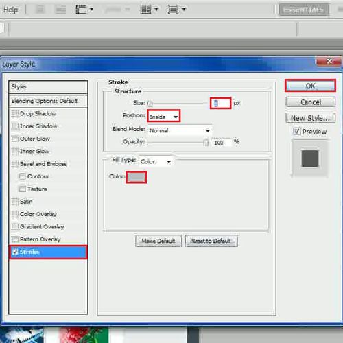
Open the blending options of the “Body” shape layer and click on the “Stroke” tab. Now set its size to “1px”, position to “Inside”, color to “bbc0c4” and click on the “OK” button to apply it. Apply the same settings on rest of the image holders.
In the same way, alter the stroke settings of the rating star. Select the “Star” shape layer, open its blending options and click on the “Stroke” tab. Now set its size to “1px”, position to “Inside”, choose the color as “7892a4” and click on the “OK” button to apply it. Similarly, apply these settings on rest of the star shape layers.
Step # 13 – Adjust the Drop Shadow for Selected Page
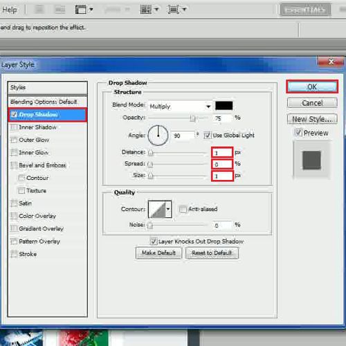
Now open the blending mode of the page selection shape and move over to the “Drop Shadow” tab. In this tab, change its distance to “1px”, spread to “0 percent”, size to “1px” and click on the “OK” button to apply it.
Step # 14 – Apply a Noise Filter
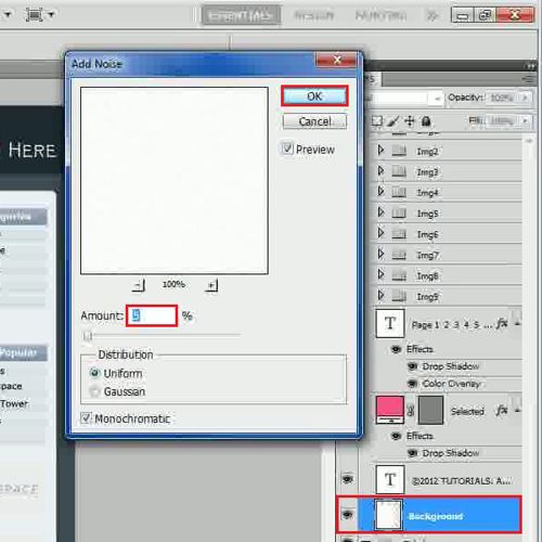
Once done, go to the “Filter” tab, select “Noise” and click on the “Add Noise” filter from the list. Set the amount to “5 percent” and click on the “OK” button to apply it on the layer.
Step # 15 – Adjust the Drop Shadow for Background
Now open the blending options of the “Background” layer and click on the “Drop Shadow” tab. Choose its blending mode to “Normal”, opacity to “40 percent” and distance to “5px”. Now set its spread to “0 percent”, size to “10px” and click on the “OK” button to apply it.
In the end, you can make some minor adjustments to the text according to your preference and requirements. Select the main category’s label and adjust its size according to the image place holder.
You can even further customize and personalize the layout by decorating it with different Photoshop brushes which in turn can help you create various Photoshop patterns on your layout.
 Home
Home