In this tutorial, we’re going to show you the new charts available in Excel 2016.
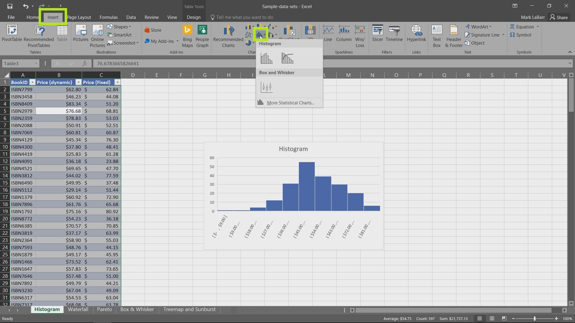
To get started, find Insert Tab, where you can find different options for charts, including Recommended Charts.

Choose Histogram option. When creating charts, we can deselect some of our prices, choosing only fixed or dynamic ones. Also you will be able to change its name or design (click Design tab).

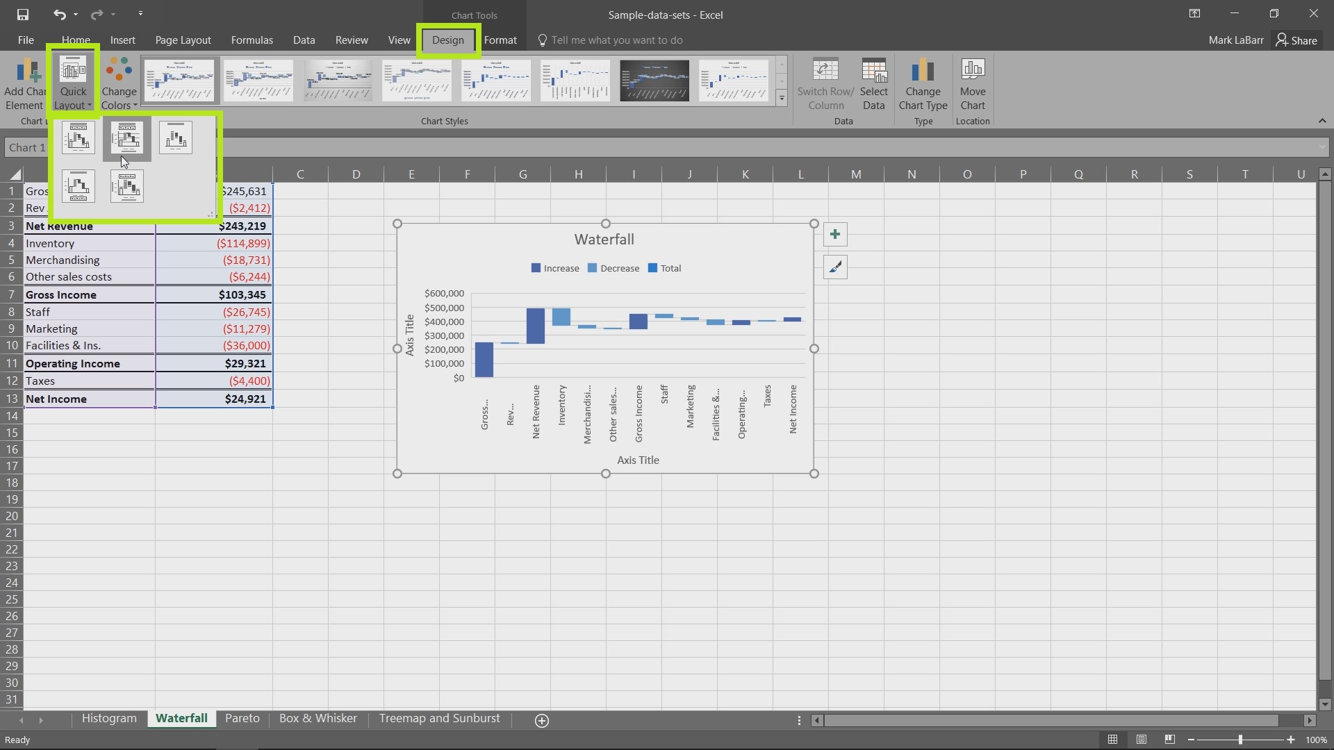
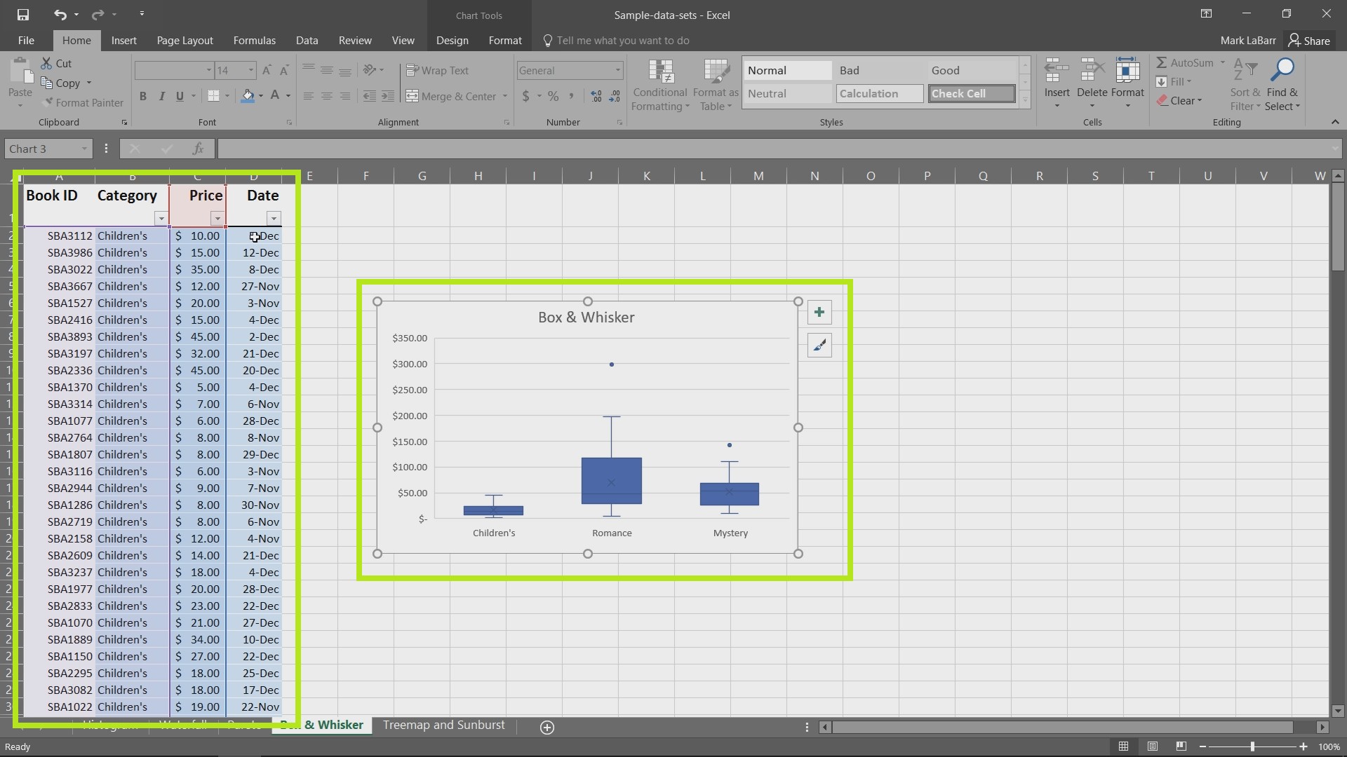
Here you can add some other chart elements (Legend, Labels, Axes, etc.). There are many kinds of Charts we can use for different purposes, like Waterfall Chart, Pareto Chart, Box and Whisker graphs, and so on.

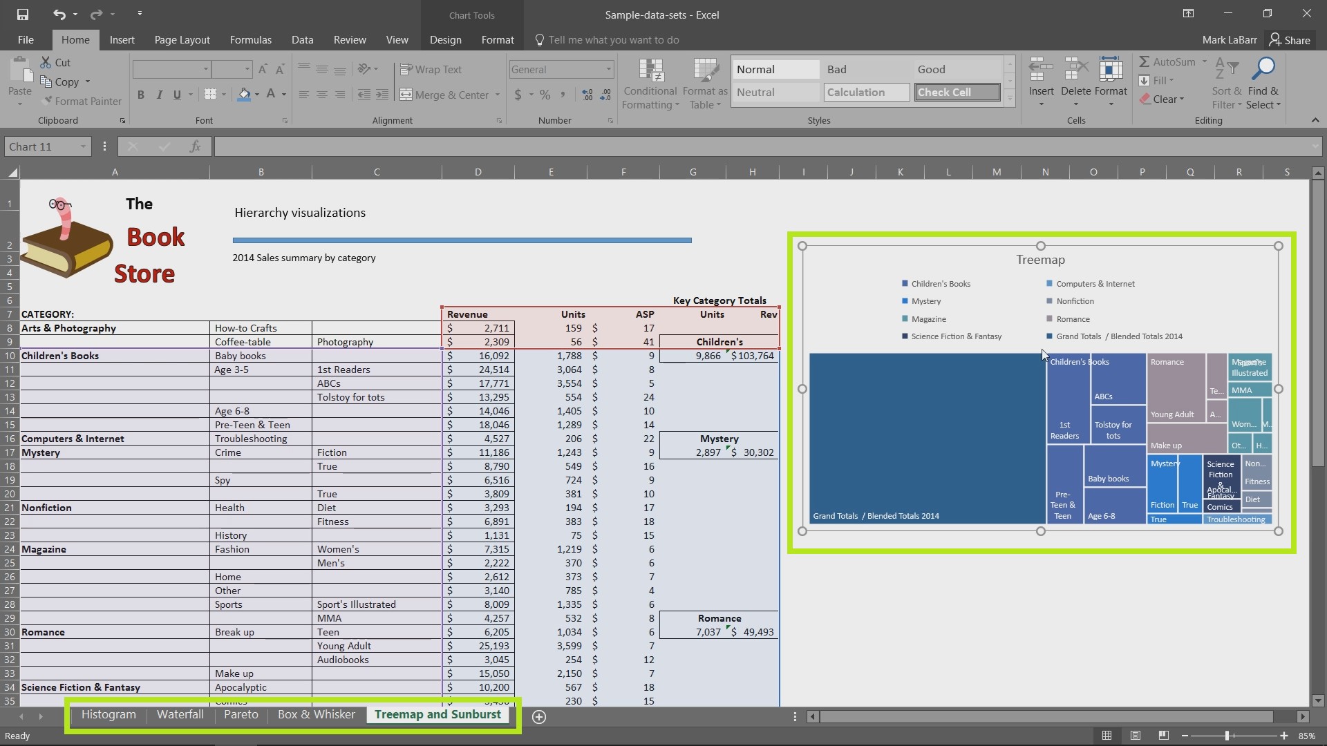
Treemap and Sunburst graphs is a very convenient way to collect and analyze data as well.

 Home
Home