When presenting factual data, charts or other graphical representation forms do the job best. They add a great look to the document by presenting every detail in an orderly fashion. It might occur that what you created is not the way you wanted it to be. Then you simply think for the modification of that chart. This Microsoft Word tutorial will teach you how to modify a chart after you have created it.
In this tutorial, you will specifically learn how to modify chart data in Microsoft Word.
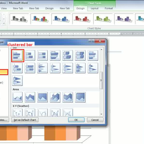
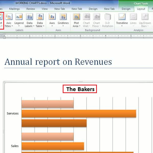
Step # 1: Modify the Chart Type
In the first step, you just need to go to the office button and open up the chart in which you want to do modifications. Whenever you select a chart and start working on it, Chart Tools appear on the top with the Layout, design and format tabs activated. When you click on the ‘Change Chart Type’ button, a new window will appear in front of your screen where you will be presented with different chart styles. Let’s say, you have selected ‘Clustered Bar’ from the ‘Bars’ section.
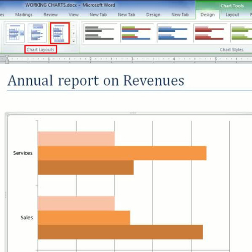
Step # 2: Modify Chart layout:
This software also allows you to play with the different color schemes for a chart. For applying colorful schemes, go to the ‘design’ tab. Over there, go to the ‘chart layout’ group which consists of different layouts. In this Microsoft Word tutorial, we selected the one with the legends at bottom.
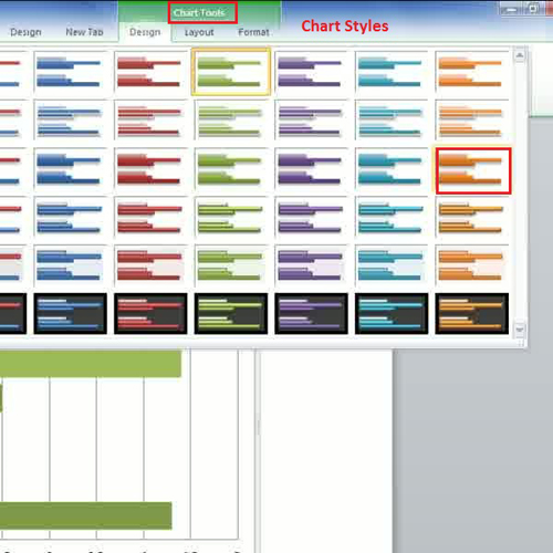
Step # 3: Chart Styles
Another way of modifying the chart style is to directly select different ‘Chart Styles’ available in the design tab. Hover over different chart styles and the chart style will be applied to your chart in the document for preview purposes. Once you click on any particular style, your current chart style will be modified accordingly.
Step # 4: Modify the Chart Title
A title is given to a chart to represent what a particular chart represents. The title of the chart can be edited in a very simply way; click on it to select it and erase the existing title. Once erased, you can simply type in the new title you want to assign to your chart. Another way to do so is by clicking on the ‘Chart title’ drop down button available under the ‘Layout Tab’ and selecting where you want to place the title.
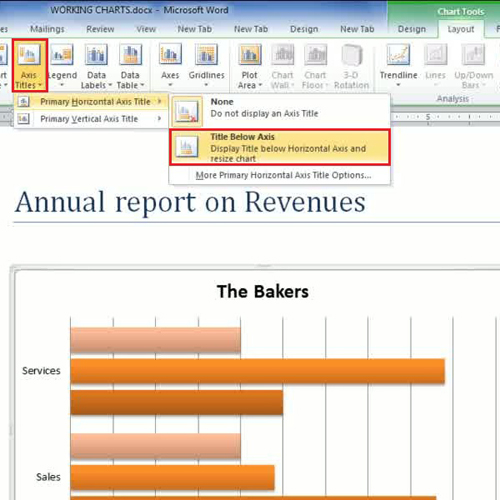
Step 5: Axis Titles:
In every chart or graph, there is x and y axis on the basis of which we put values in the graph.
In order to do so, we can go to the ‘label’ section of the ‘Layout’ tab and click on the ‘Axis Titles’ button to change the titles of the axis. Over here, you can set different options for horizontal and vertical axis by giving them titles here.
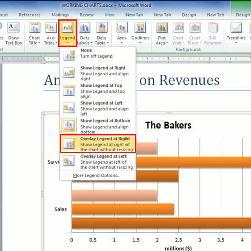
Step # 6: Legends
The legends in a chart tell you what each column or bar represents and they are usually color coded. You can adjust where you want to place the legend by going to the ‘legend’ drop down menu in the ‘layout’ tab.
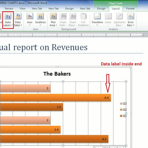
Step # 7: Data Label
The data labels option in the ‘Layout’ tab allows you to insert actual numbers inside the bar.
You can also apply options such as the ‘chart tables’ and ‘axis’ in a chart.
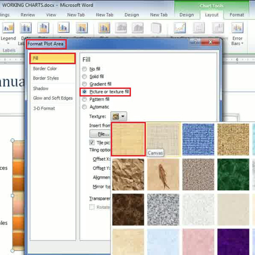
Step # 8: Format Chart Areas:
Another interesting feature provided by MS Word is that you can fill in charts by applying different effects such as picture or gradient. Double click on the chart area plot, after which a window pops up titled ‘Format chart area’. Go to the ‘Fill’ tab, then select ‘picture or texture fill’ and choose the texture that matches your chart scheme.
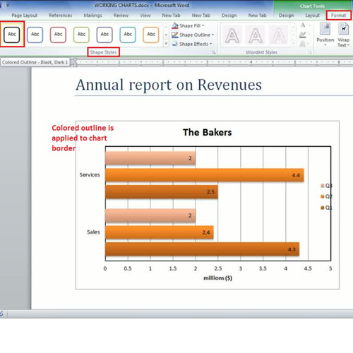
Step # 9: Borders with styles
Different colors border can be applied to the bars or the entire chart. Click on the ‘format’ tab and you will find the ‘Shape styles’ option. From here, you can select any border style by first selecting the area in the chart where you want to apply the border. Let’s say, you have applied it on the boundary of the chart.
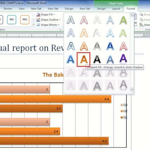
Step # 10: Word Art in a Chart.
If you are aware of word art, then you can apply word arts in your charts. Microsoft Word also provides you this feature where you can simply modify the ‘Chart title’ by first selecting the title content and then going to the ‘Word Art Style’ option under the ‘format’ tab. Various word art styles will be displayed to you from where you can select the one that meets your requirements. In this manner, you can easily modify the chart data as per your preferences.