As soon as you launch Adobe Premiere CS 6.0, you will see a completely redesigned interface.
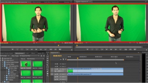
The default workspace that you are seeing is called the 2-up workspace. This means that most of the screen’s real estate is now taken over by the Source window on the top left, which is where you will “cut” your video clips, and the Monitor in the top right, which reflects what is in your timeline below.
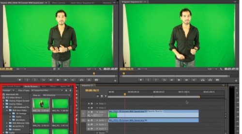
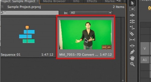
In the bottom left corner, you will find the “Program” panel. Here is where you will find and place all of the media that you will be working with in your project.
Each clip that appears in the program window will now appear as an interactive 16:9 thumbnail. When you move your mouse of a frame, you are able to “hover-scrub”, which allows you to get a quick preview and idea of what the media is that you are working with.
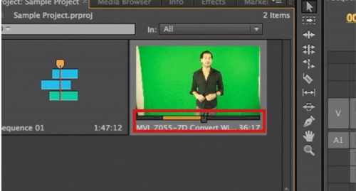
If you “single click” on a clip in the Program window, you are able to move a Mini Playhead to see specific frames of each clip, as well as cut your clips INSIDE this window using the letters I and O on your keyboard to set the range that you would like to use from this clip.
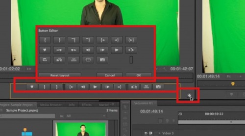
Adobe’s Premiere Pro is all about customization for the editor. This can be best noted by customizing the edit button configurations in the Source window for cutting and playing back your clips. In order to customize your edit buttons, simply click on the plus button in the bottom right corner of your Source window. From here, you can drag and drop any of the buttons that you find helpful to have when you are navigating through an editing session.
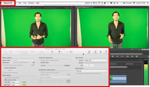
Another great addition to Adobe Premiere 6 is the “Don’t stop Playback” feature, which allows you to move around the interface or even outside of the program, and still have the playback happen in order to keep the flow of creative editing alive. For editors coming to CS6 from other software of the past, this is a great feature to note.
 Home
Home