Adobe Photoshop tutorials provide you with easy steps to create different types of effects in this software.
In this tutorial, however, we will show you a simple and easy method to create a User Interface button from scratch. Here we will also discuss some innovative color combinations, text alignments and blending modes which all together create a nice and simple UI button. In this series, you will also learn to use the button on the web page by entering its HTML codes and completing a whole menu with same technique.
Follow this step by step guide to learn how to create a UI button in Photoshop.
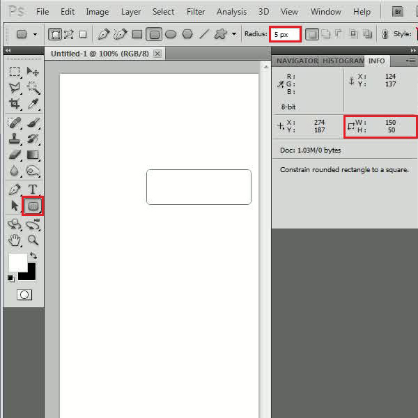
Step # 1 – Drawing a Button Shape
In the first step, select the “Rounded Rectangle” tool amongst the different Photoshop shapes from the menu and set its “Radius” to “5 px”. Now draw a box of “150 px” width and “50 px” height on the blank page. Change this layer’s name to “Base Shape” and double click on it to open the “Blending Options” panel.
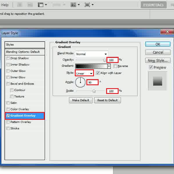
Step # 2 – Adjusting the Gradient Overlay
Now move over to the “Gradient Overlay” tab and change the “Blending Mode” to “Normal. Once done, set the “Opacity” to “100 percent”, “Style” to “Linear”, “Angle” to “90 degrees” and “Scale” to “100 percent”.
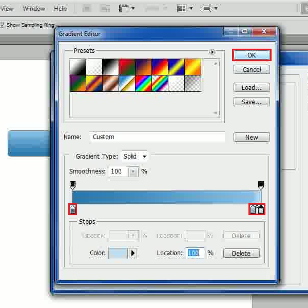
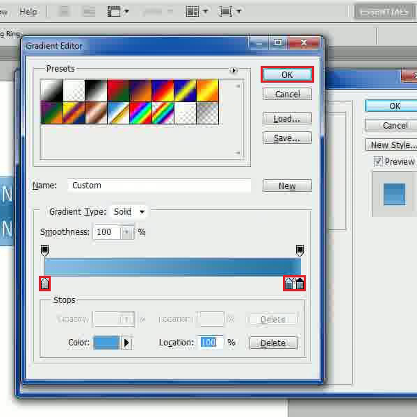
Step # 3 – Choosing a Gradient Color
In the next step, click on the “Gradient” option and choose the color by entering its code as “2877ac” at the “Location” of “0 percent”. Now choose the color as “87bfs6” at the “Location” of “95 percent” and “c2def1” at the “Location” of “100 percent”. Click on the “OK” button to save these settings and exit.
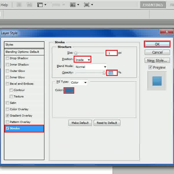
Step # 4 – Adjusting the Stroke Settings
Now move over to the “Stroke” tab and set its “Size” to “1 px”. Once done, choose the “Position” to “Inside”, “Blend Mode” to “Normal” and “Opacity” to “100 percent”. Once done, select the color by entering its code as “2877ac” and click on the “OK” button to apply it.
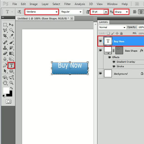
Step # 5 – Inserting the Label
Now select the “Text” tool and choose the “Fonts” as “Verdana”, “Size” to “30 pt”, “Anti-Aliasing” method to “Sharp”. Once you have selected these settings, choose the “Color” as “White” and enter the button’s text. Now adjust the placing of the text according to the button.
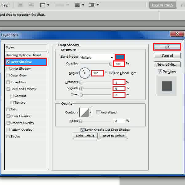
Step # 6 – Adjusting the Drop Shadow Settings
In the next step, double click on the layer name to open its “Blending Options”. Now move over to the “Drop Shadow” tab, change the “Blend Mode” to “Multiply” and choose the “Color” by entering its code as “2877ac”. Set its “Opacity” to “100 percent” and set the “Angle” to “120 degrees”. Once done, set the “Distance” to “1 px”, “Spread” to “0 px”, “Size” to “2 px” and click on the “OK” button to apply it.
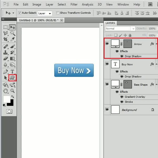
Step # 7 – Inserting an Arrow Shape
Now select the “Custom Shape” tool, choose the “Arrow” shape and draw it on the canvas. Place it next to the text over the button and keep it in the same size as of the lower case text used. Once done, change this layer’s name to “Arrow”, right click on the text layer, select the “Copy Layer Style” option and paste it on the “Arrow” layer. Now select all layers except the “Background” layer and press “Ctrl+G” keys from the keyboard to group them and change its name to “Normal”.
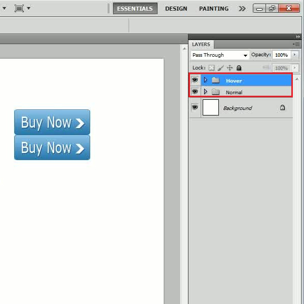
Step # 8 – Duplicating the Button
Once done, duplicate the group by choosing its name as “Hover” and place it below the original image. Now maximize the group and double click on the “Gradient Overlay” option of the “Base Shape” layer.
Step # 9 – Choosing a Different Gradient
Now click on the “Gradient” option and choose the color by entering its code as “87bfe6” at the “Location” of “0 percent”. Choose the color “2877ac” at the “Location” of “95 percent” and “4c9fd7” at the “Location” of “100 percent”. Once done, click on the “OK” button to save these settings and apply it on the image.
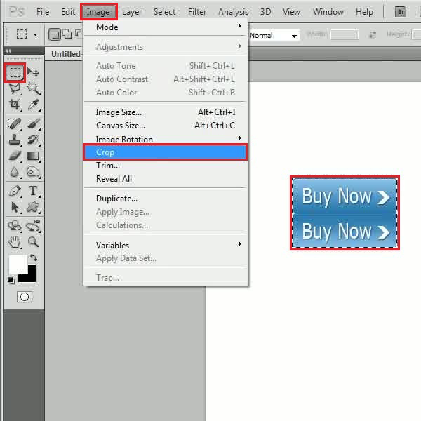
Step # 10 – Cropping the Button Image
Now click on the “Rectangular Marquee” from the menu to select the image, to outline the shape made from the rounded rectangle tool selected from the Photoshop shapes. After selecting it, go to the “Image” menu and click on the “Crop” option from the list.
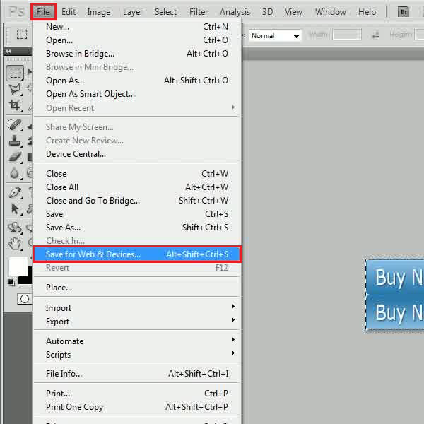
Step # 11 – Saving for Web and Devices
Once you have cropped the image, go to the “File” menu and select the “Save for Web & Devices” option from the list.
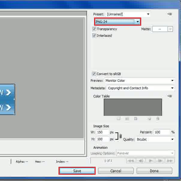
Step # 12 – Choosing a PNG Format to Save
In the final step, choose the “PNG-24” option from the menu and click on the “Save” button to save this image and you’re done.
You can view other Adobe Photoshop tutorials as well to understand how to create more illustrations in this software.
 Home
Home